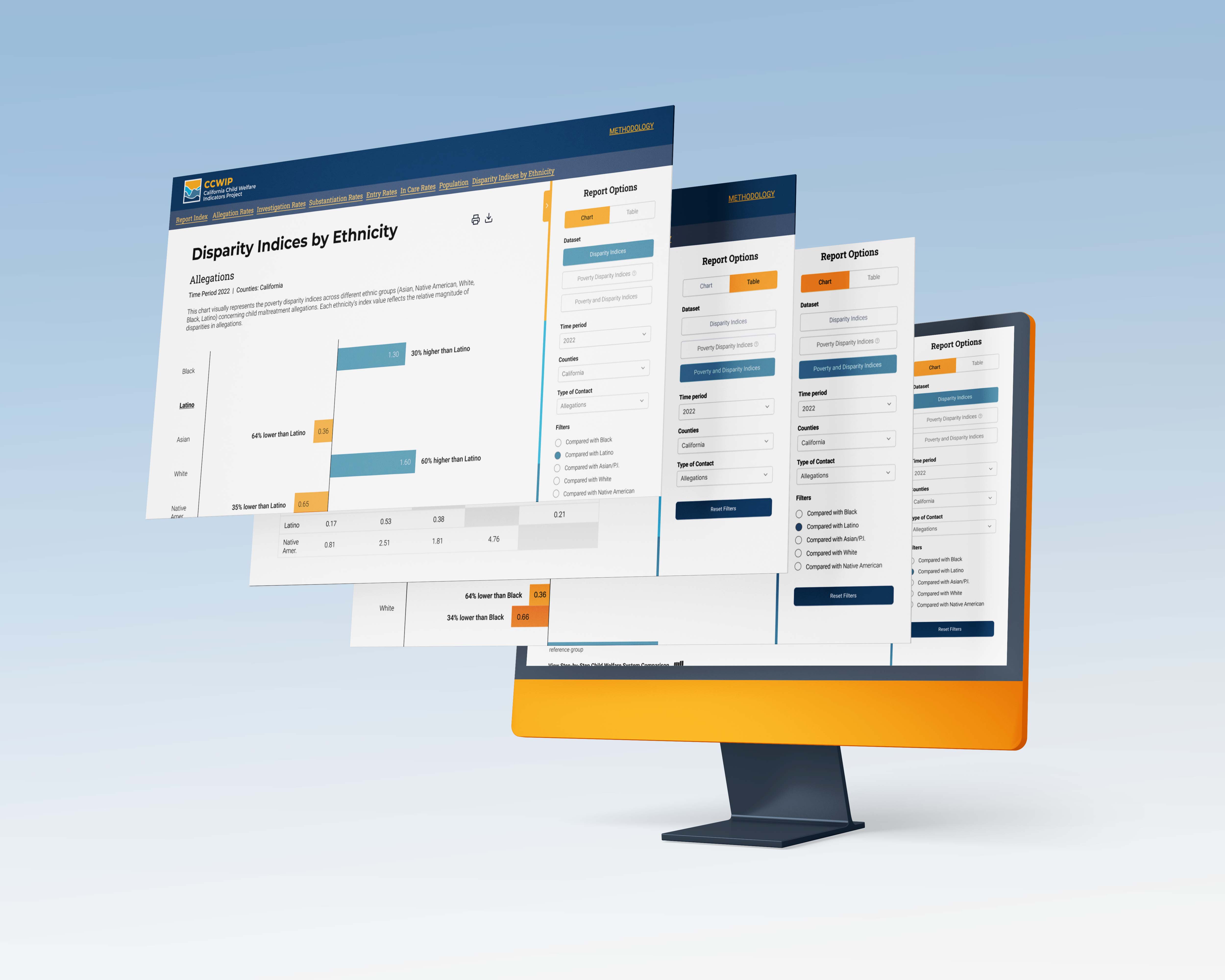
The California Child Welfare Indicators Project (CCWIP) is an innovative initiative designed to provide comprehensive access to critical child welfare data in California. Aimed at a diverse audience that includes policymakers, researchers, social welfare professionals, and the general public, CCWIP focuses on presenting key child welfare indices, such as Disparity Indices and Poverty Disparity Indices, in an accessible and user-friendly manner.
Link to Collection
The primary challenge addressed by CCWIP is the difficulty in accessing and understanding complex child welfare data, particularly for those outside the field of child welfare research. Users often struggle with the technical language and the intricate nature of data presentation, which can be overwhelming and lead to misinterpretation. This barrier hinders effective research, policy-making, and public understanding of critical issues surrounding child welfare.
To redesign the presentation of Disparity Indices, including Poverty Disparity Indices, making them more accessible and understandable to a general audience, free from overwhelming technical jargon.
To provide an intuitive, user-friendly platform that facilitates effortless navigation and data interpretation. This includes the integration of interactive tools, clear visualizations, and straightforward language.
To adopt a human-centric approach in the platform's design, incorporating storytelling and empathetic elements that connect users emotionally with the data and the broader context of child welfare.


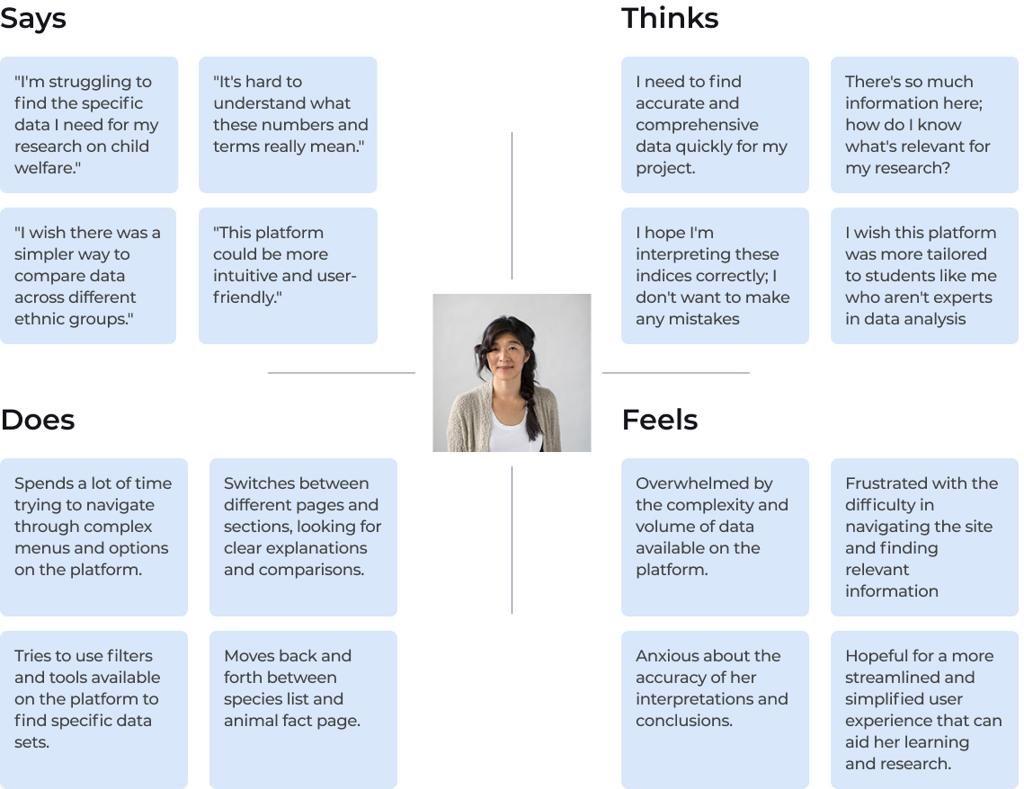
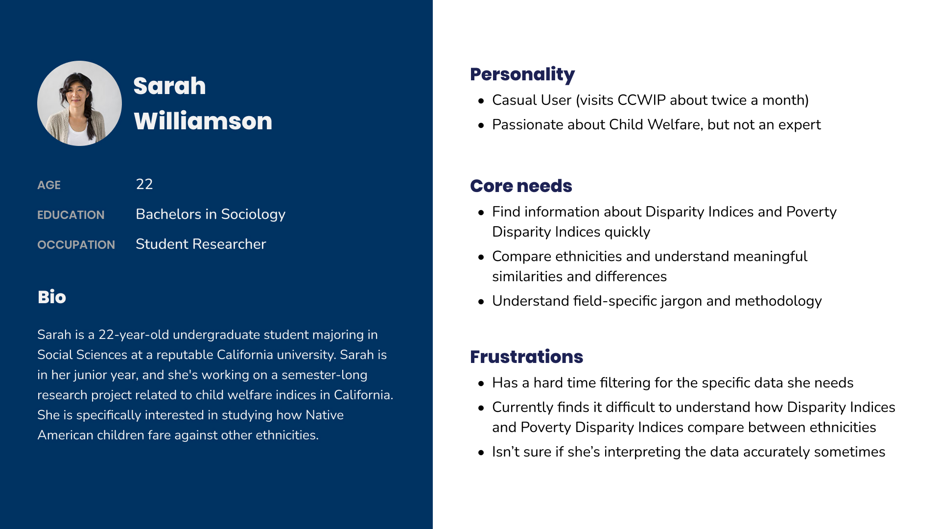
The target audience for the California Child Welfare Indicators Project (CCWIP) encompasses a broad spectrum of users, including journalists, students, and researchers, who may lack extensive expertise in technical data analysis related to child welfare. This diverse group requires a platform that simplifies complex statistical information, making it more accessible and understandable.


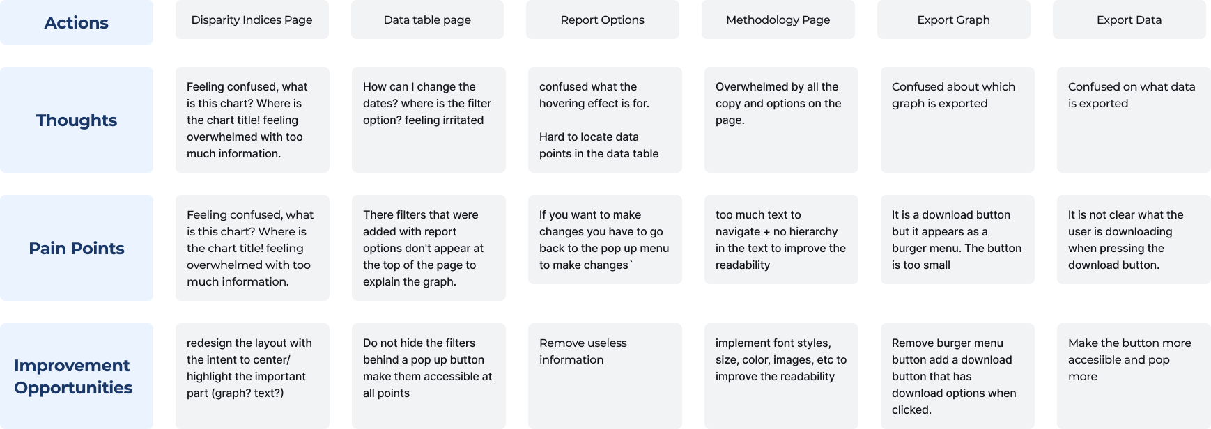
User Experience and Interface Design: Users find the platform overwhelming and un-intuitive, particularly due to the presentation of raw data, lengthy paragraphs, and technical terminology. The confusion around interacting with the page, such as unclear buttons and hidden Report Options, further exacerbates the challenge for users, especially those not familiar with the topic or data.
Data Accessibility and Comprehension: Users are confused by elements like missing chart titles and unclear indications of what is represented in graphs and tables. The difficulty in changing dates, finding filter options, and understanding the purpose of hovering effects points to a need for a more intuitive way of interacting with the data. Locating specific data points and understanding the content of exported graphs or data also pose significant challenges.
Information Overload and Layout Issues: The platform currently suffers from an overload of text and options, which overwhelms users. The lack of a clear hierarchy in the text presentation makes it difficult to navigate and extract relevant information. The confusion over the functionality of buttons, such as the download button disguised as a burger menu, adds to the user's frustration
How might we redesign the CCWIP page to best explain disparity indices to a general audience unfamiliar with data terminology?
We needed to work within resources and tools CCWIP already utilizes, and preserve the ability to look at the data from multiple time periods and at both the state and county level. Accessibility; We needed to make sure our design would work for accessibility tools such as screen readers and fell within W3C standards.

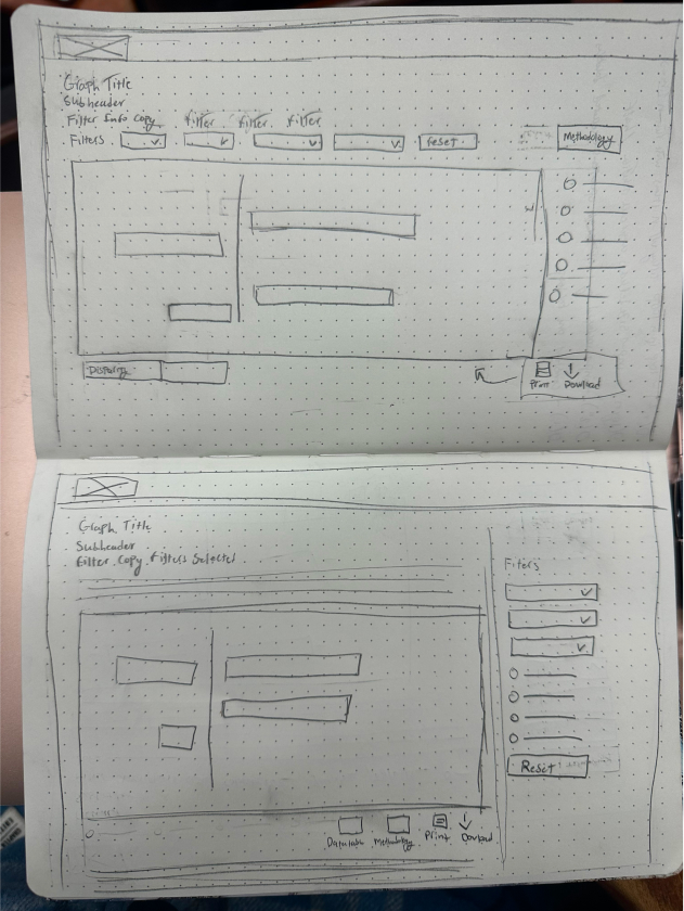
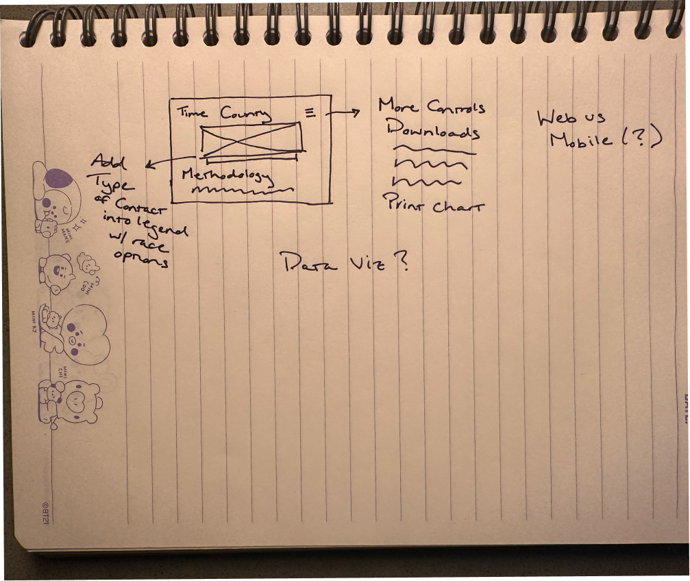
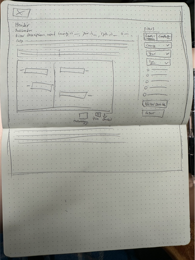
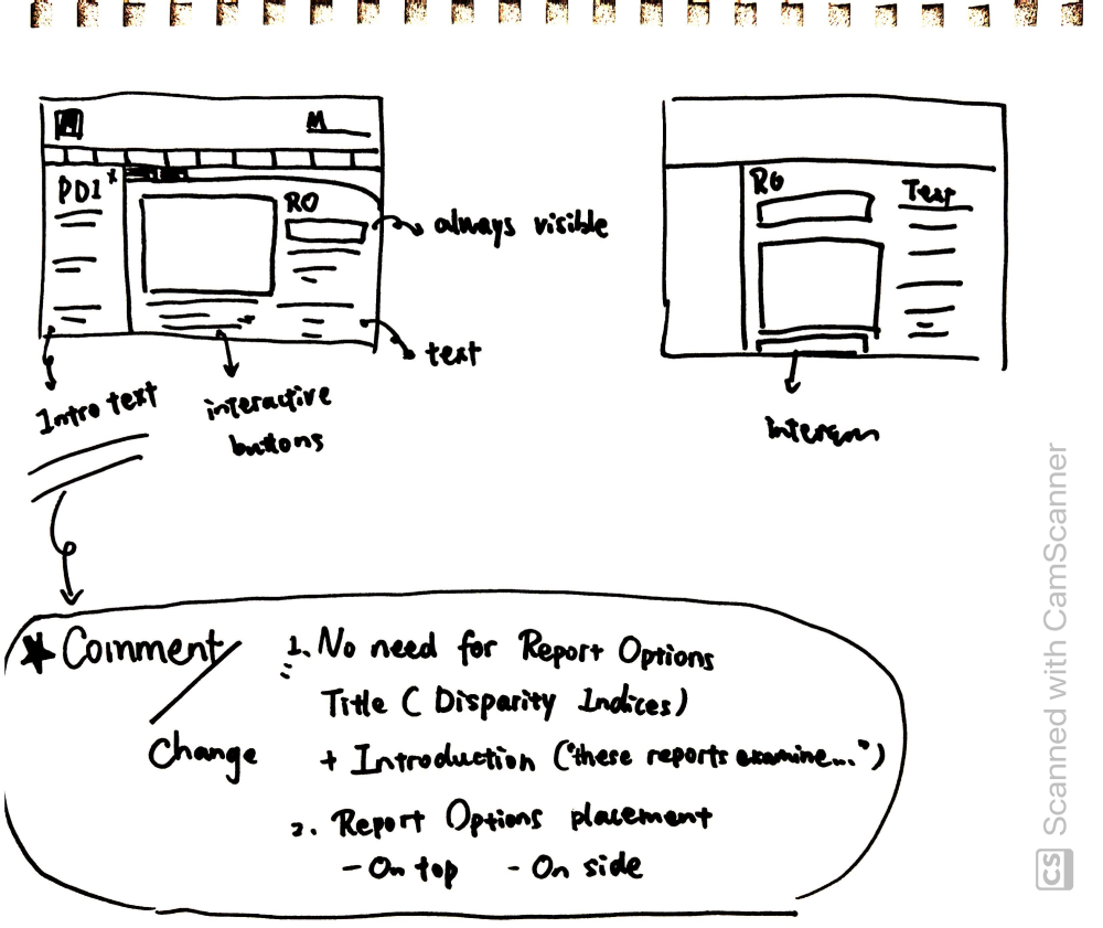
Our sketches for the redesigned California Child Welfare Indicators Project (CCWIP) platform serve as a foundational blueprint, capturing the essence of our envisioned improvements. They illustrate a user-centric layout with streamlined navigation and clearer data presentation, emphasizing accessibility and intuitive design. Th
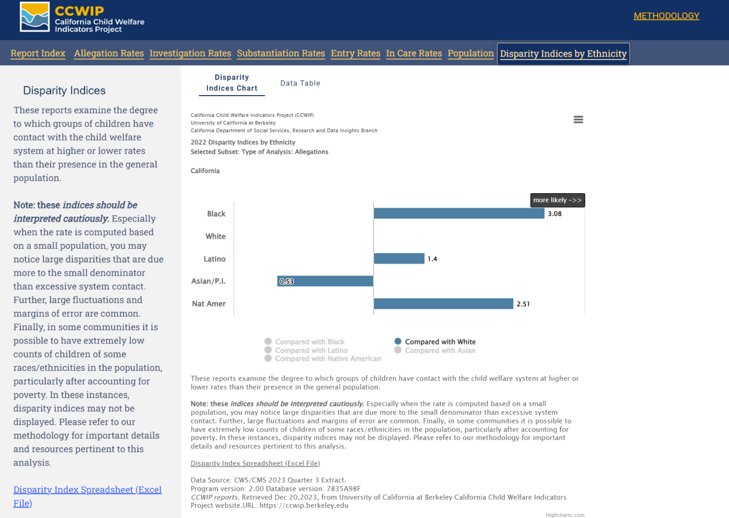
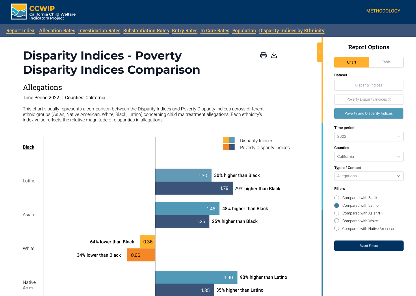
The old screen of the CCWIP platform was characterized by a high degree of complexity and information density. Users were presented with a vast array of raw data and extensive text, often leading to an overwhelming experience. Navigation posed a significant challenge due to the lack of intuitive design elements. Critical features such as filters and report options were not prominently displayed, often hidden behind pop-up menus or represented by unclear icons.
The data visualization, including charts and tables, lacked clear labeling and titles, adding to the confusion. The interface, with its dense layout and technical jargon, made it difficult for users, especially those unfamiliar with child welfare data, to efficiently locate, interpret, and extract valuable information. Furthermore, the download functions were not user-friendly, often leaving users uncertain about what data they were exporting.
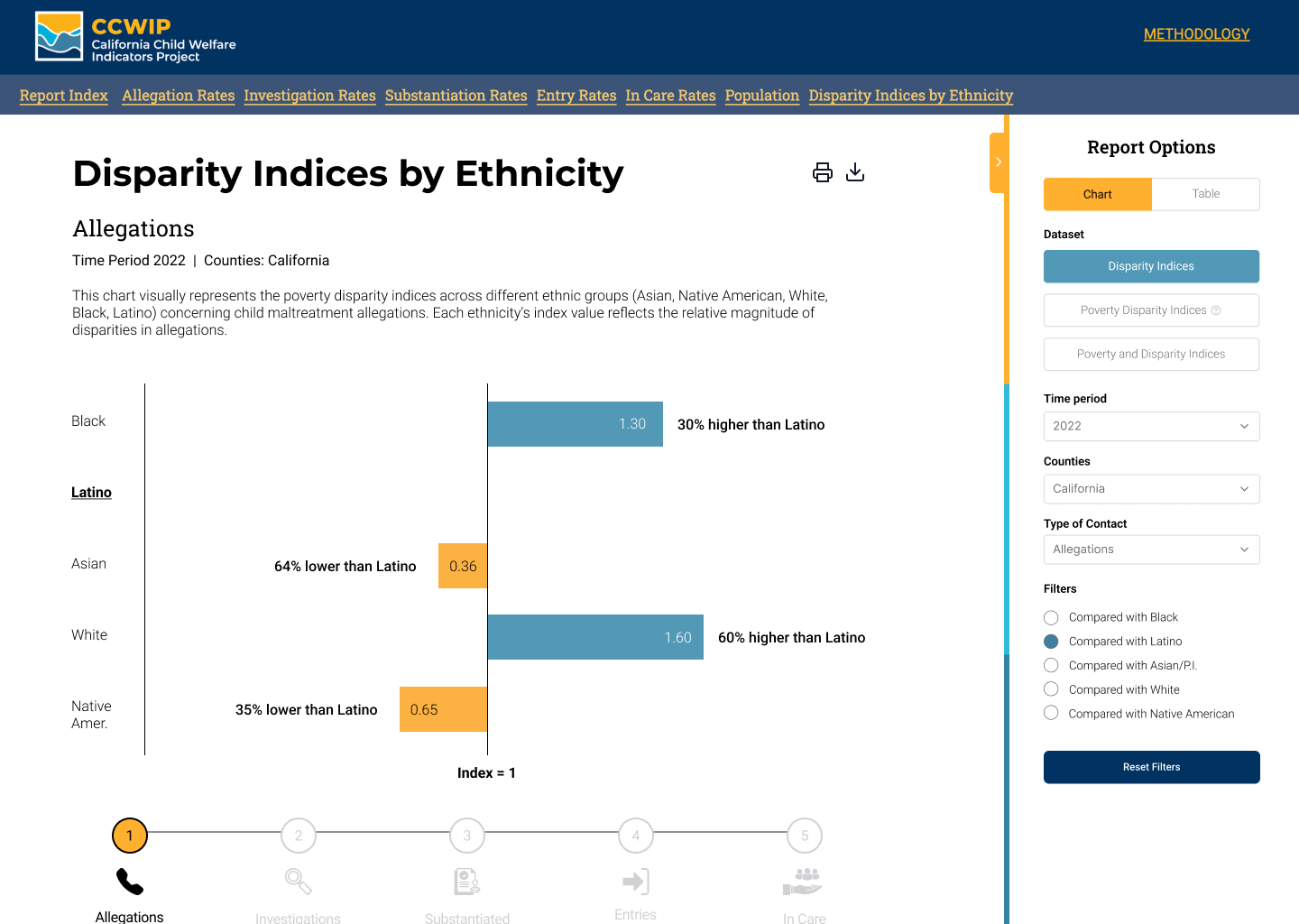
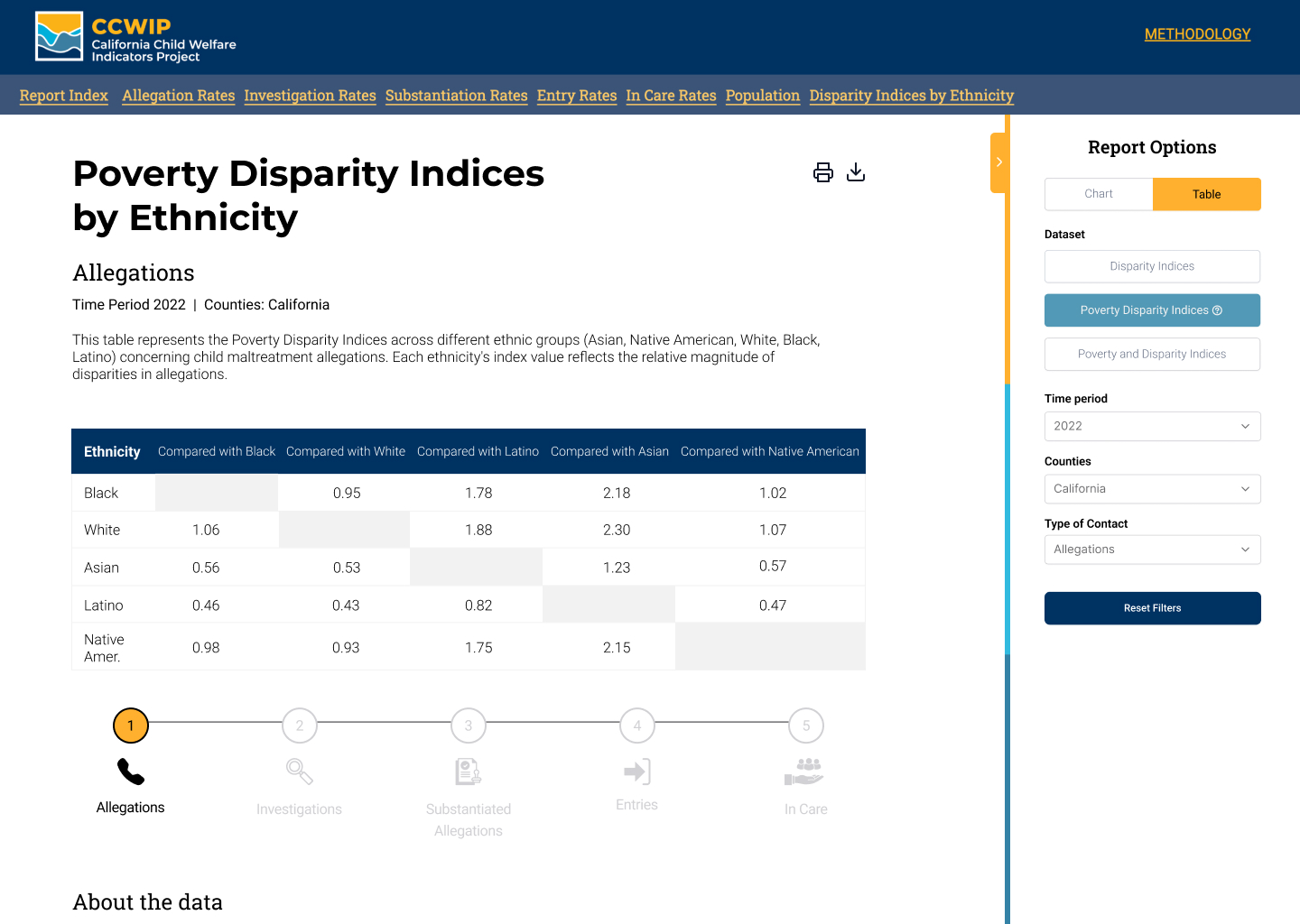
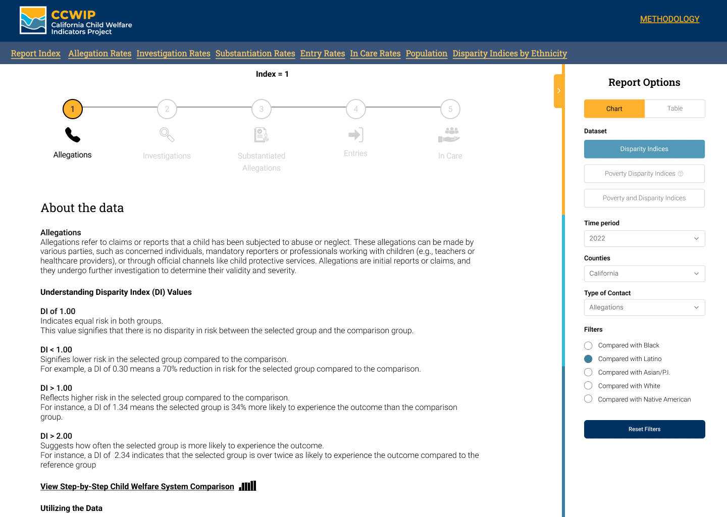
In contrast, the new screen of the CCWIP platform represents a significant improvement in terms of usability and user experience. The redesign focuses on clarity and accessibility, with a much cleaner layout that highlights key data and information and data visualizations. The overhauled interface now features the prominently displayed filters and report options, easily accessible without the need to navigate through complex menus.
The data visualizations have been simplified and are accompanied by explanatory texts and tooltips, making it easier for users to understand and interpret the data. The download functions have been revamped for clarity, with well-labeled buttons and straightforward options, enhancing the overall functionality and user trust. This new screen caters to a broader range of users, from experts to novices, facilitating a more engaging and productive experience in exploring child welfare data.


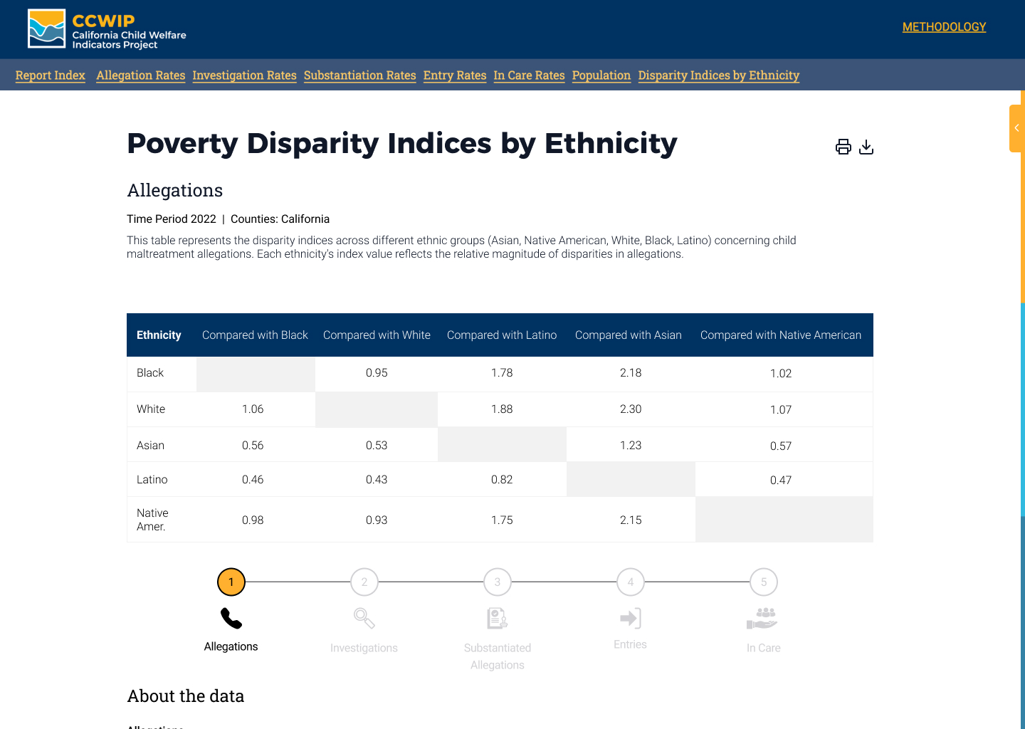
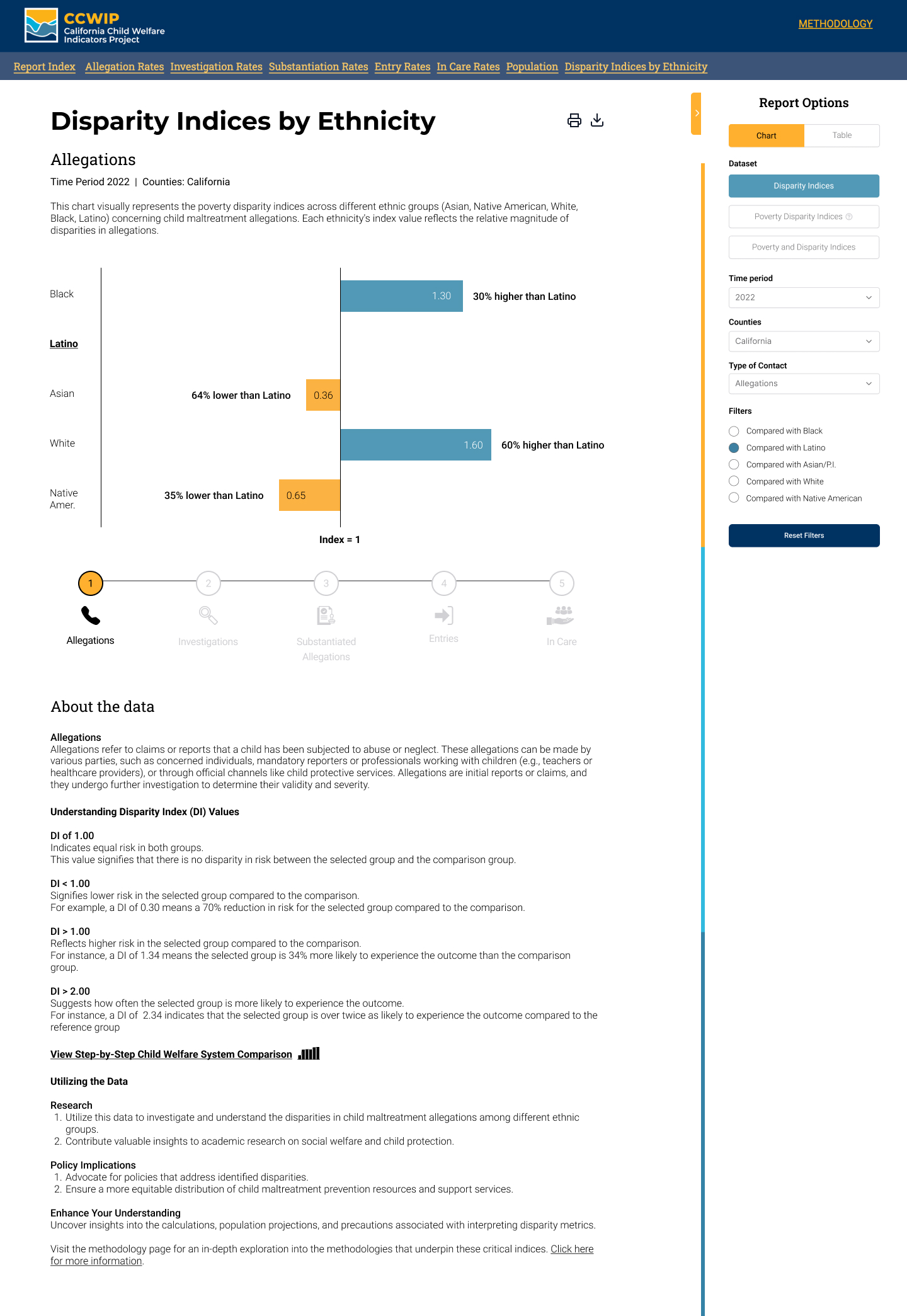
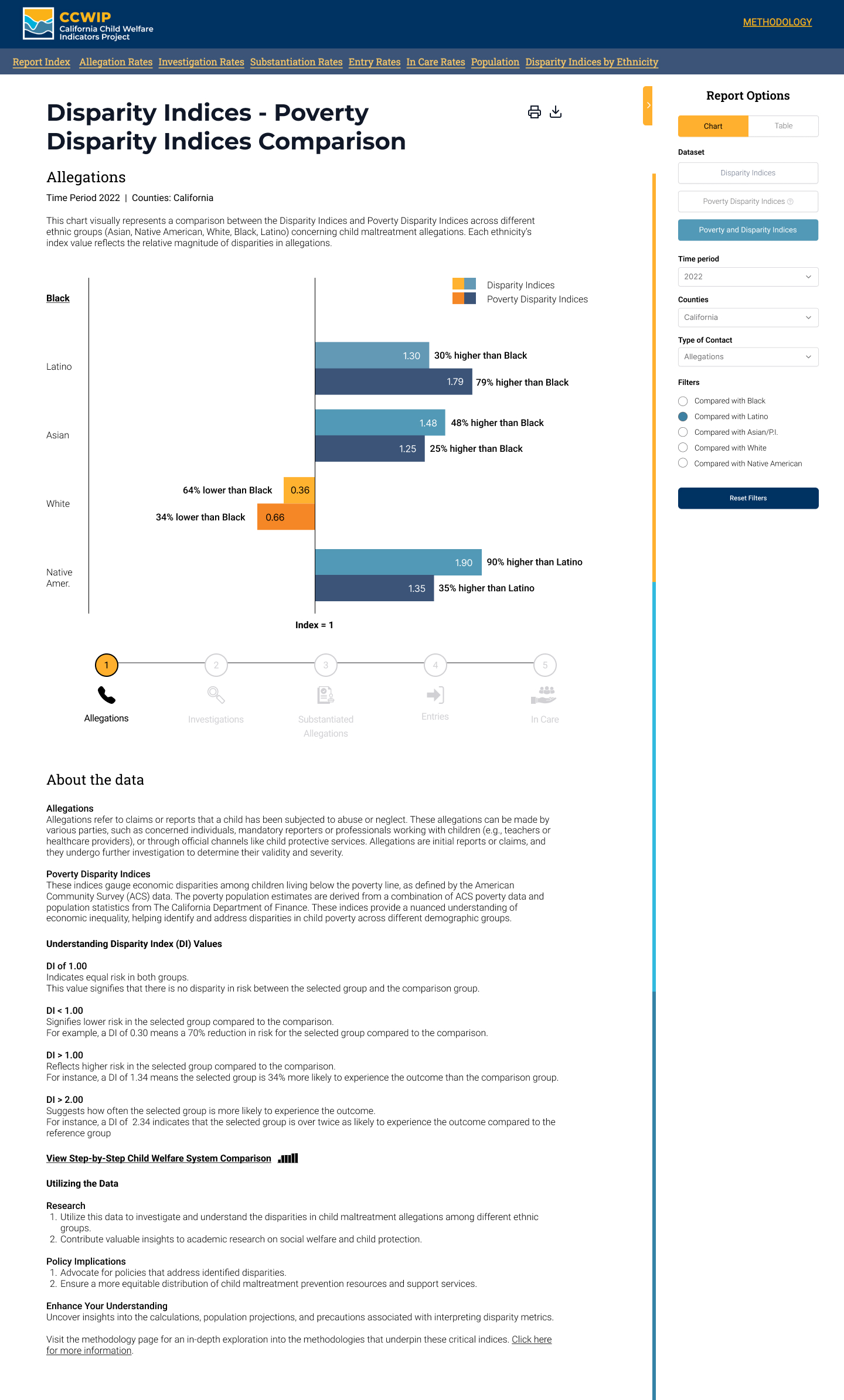
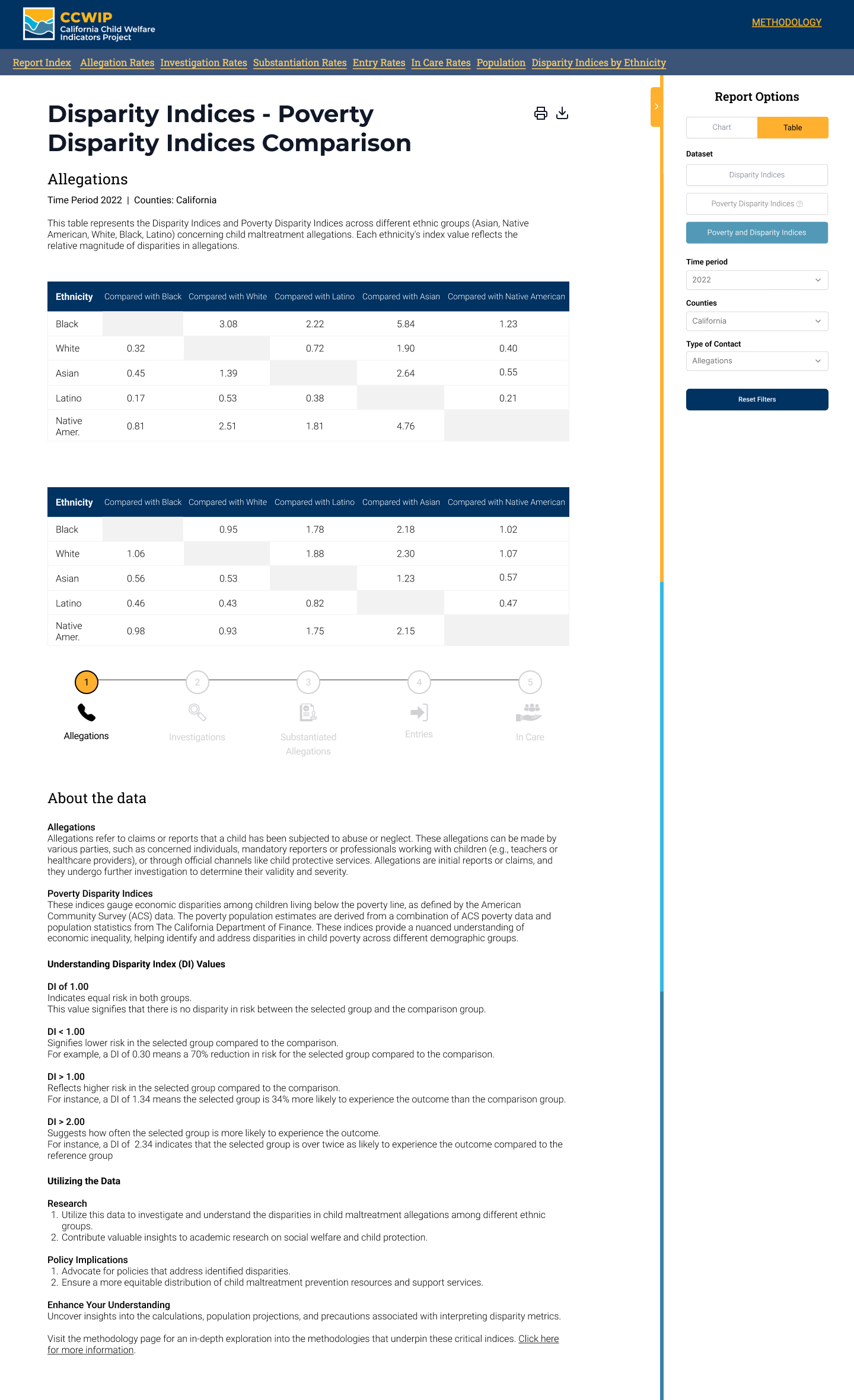
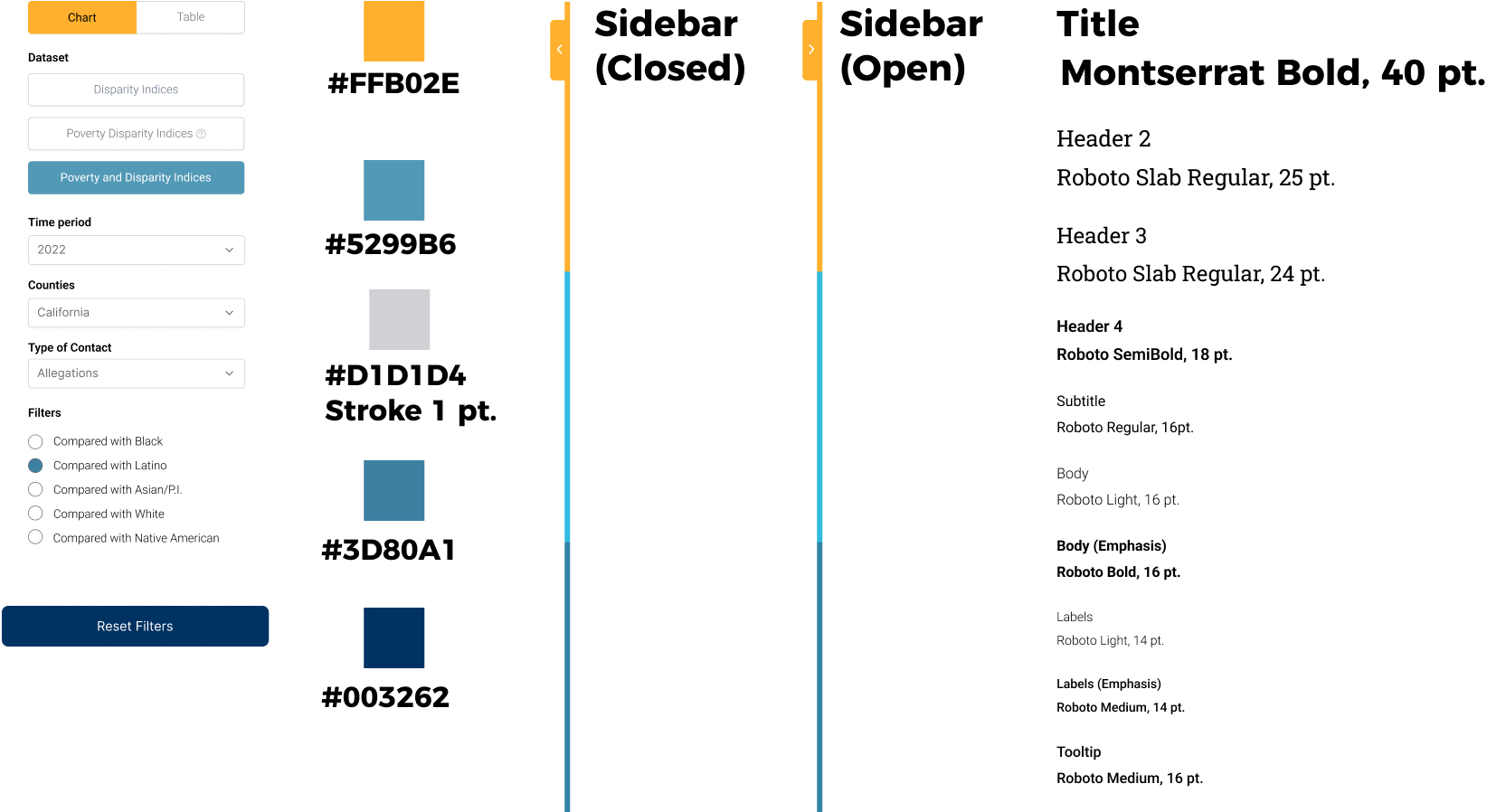
User feedback on the redesigned California Child Welfare Indicators Project (CCWIP) platform has been instrumental in understanding the efficacy of our design changes. Users expressed a marked improvement in the platform's usability, noting the enhanced clarity and accessibility of information. The simplification of complex data and reduction of technical jargon were particularly appreciated, as they made the platform more approachable for users of varying expertise. Additionally, the intuitive design elements, such as clearly labeled filters and interactive graphs, were praised for facilitating easier navigation and data interpretation.
Enhanced Clarity and Accessibility: Users appreciated the redesigned layout for its clarity and ease of navigation. The simplified data presentation and reduced jargon significantly improved their ability to understand complex child welfare data.
Intuitive Design Elements: Feedback highlighted the effectiveness of intuitive design elements, such as clearly labeled filters and interactive data visualizations, in enhancing user engagement and comprehension.
Effective Use of Visual Aids: Users noted the positive impact of visual aids like color-coding and tooltips, which aided in quickly grasping key data insights.
User-Centric Design is Crucial: The importance of designing with the end-user in mind became evident, as changes that prioritized user experience led to significantly improved feedback.
Simplification Enhances Understanding: Simplifying complex information without losing its essence is key to making data accessible to a broader audience, including those without technical expertise.
Visual Design Aids Comprehension: Strategic use of visual design elements can greatly aid in data interpretation and engagement, especially in data-heavy platforms.
Listening to Users is Vital: User feedback is invaluable in understanding the effectiveness of design changes and identifying areas for further improvement.
Balancing Detail and Clarity: Finding the right balance between providing detailed data and maintaining clarity is crucial for a data-driven platform.
The Impact of Design on Accessibility: Good design is not just about aesthetics but also about making information accessible and understandable to all users.
Iterative Design Process: The design process is iterative, and continuous user feedback is essential to refine and perfect the user experience.
The user feedback on the redesigned CCWIP platform underscores the success of our efforts in making child welfare data more accessible and understandable. The insights and takeaways from this process highlight the importance of a user-centric approach, the need for simplification, and the power of visual design in enhancing data comprehension. This feedback has been invaluable in learning how effective design can transform the user experience, ensuring that the platform not only serves its purpose but does so in a way that is engaging, intuitive, and beneficial to all its users.


