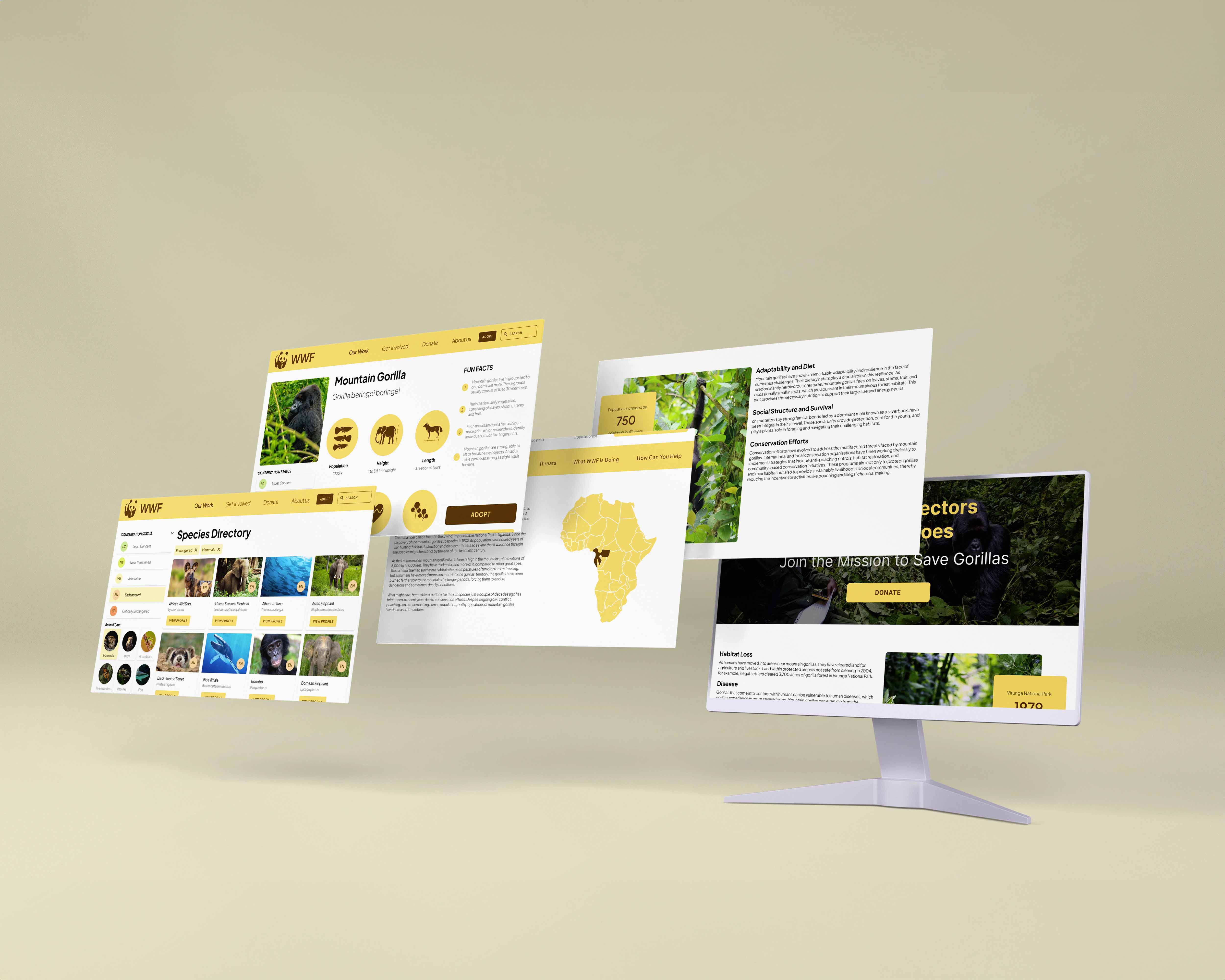
In this case study, I undertake a comprehensive redesign of the World Wildlife Fund (WWF) website's species directory, with a focus on improving its information architecture to enhance user experience
Figma Link
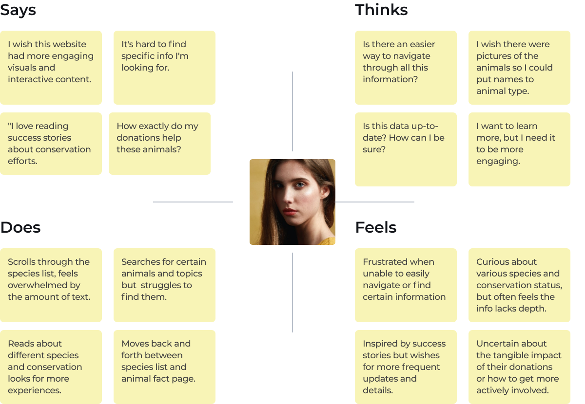
The current species list on the WWF website fails to fully engage users due to its impersonal presentation, limited interactivity, and lack of comprehensive information. Users need help to form a personal connection with the species listed, which hampers their learning experience and reduces their motivation to contribute to conservation efforts.
This project aims to revitalize the WWF species list by creating an engaging, interactive experience that encourages exploration and learning. We plan to enhance information accessibility with comprehensive, easy-to-understand details on each species, supplemented by storytelling and visual elements to foster a deeper emotional connection with wildlife.

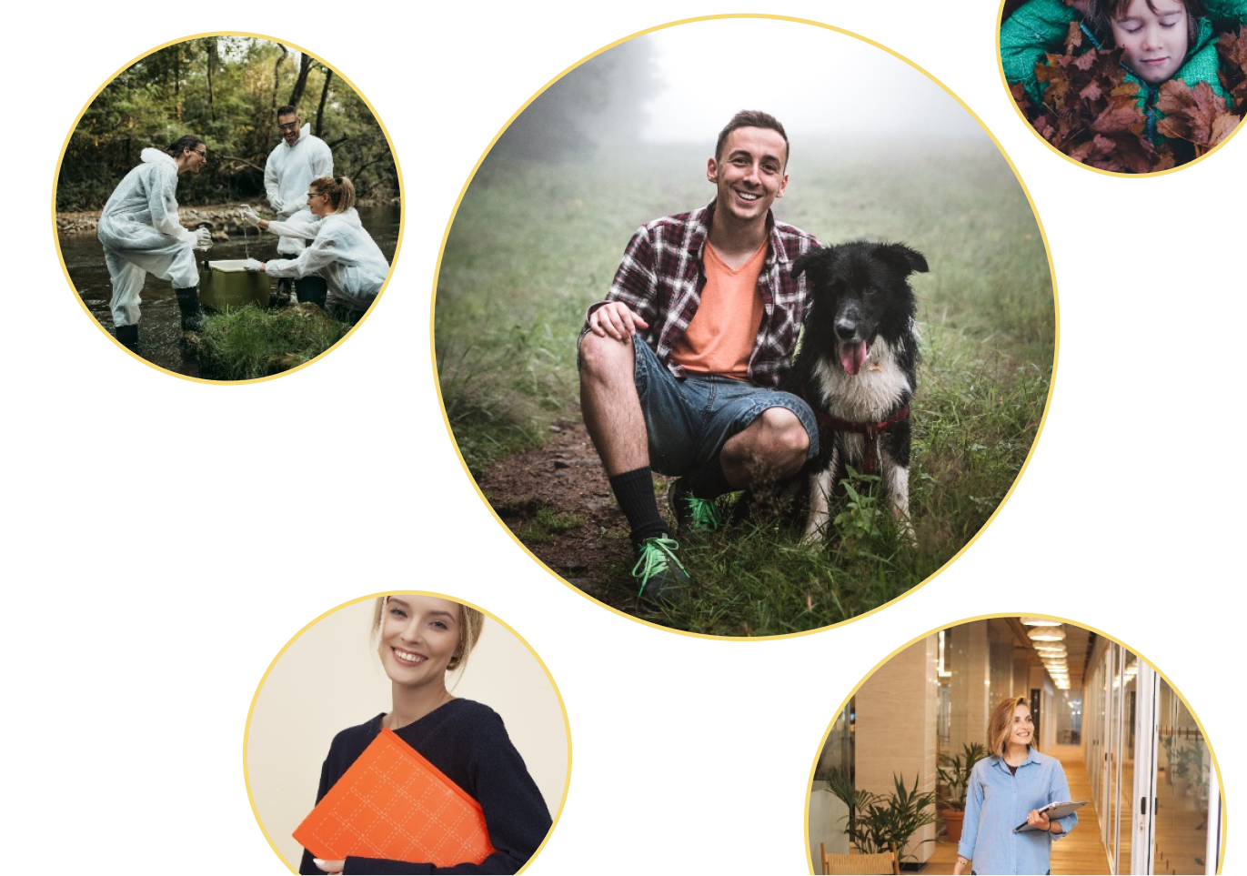
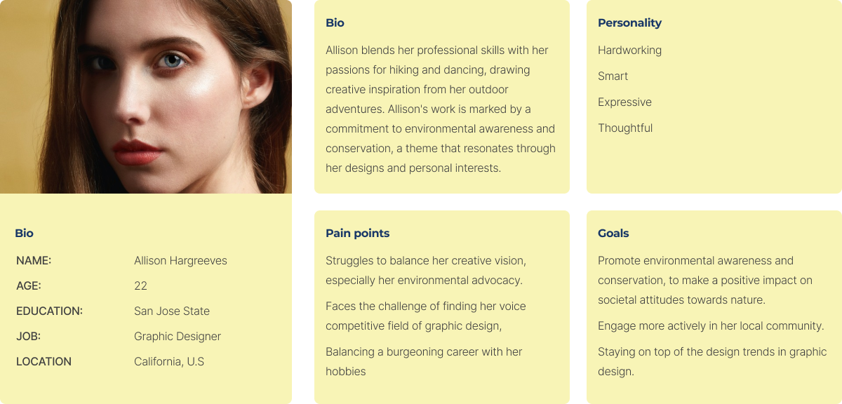
The target audience includes wildlife enthusiasts looking for conservation activities and the general public interested in understanding and contributing to wildlife preservation, as well as prospective donors and supporters who play a crucial role in conservation through financial contributions and symbolic animal adoptions.


Enhance the visual appeal of the website by incorporating compelling imagery and infographics to better illustrate conservation data and engage users. Update the website with a modern, responsive design to improve overall usability, especially for mobile users, ensuring a seamless experience across all devices. Implement stronger storytelling techniques and clear calls to action within the content to emotionally connect users and encourage active support for conservation efforts.

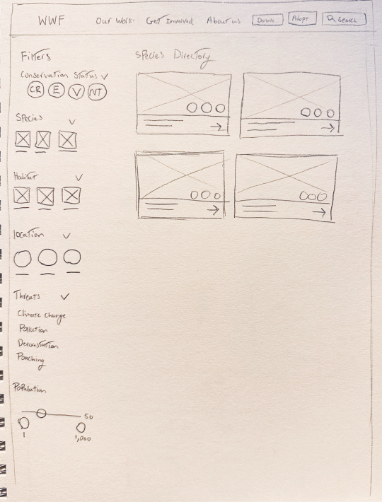
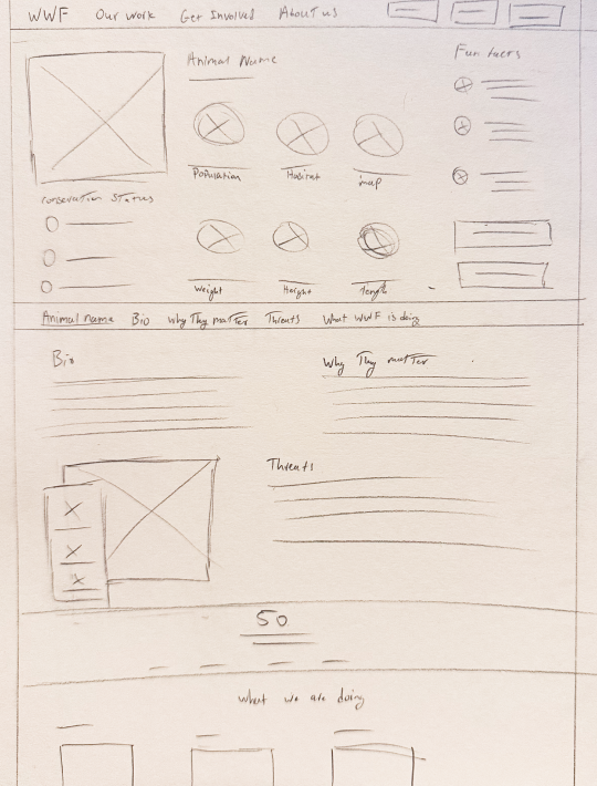
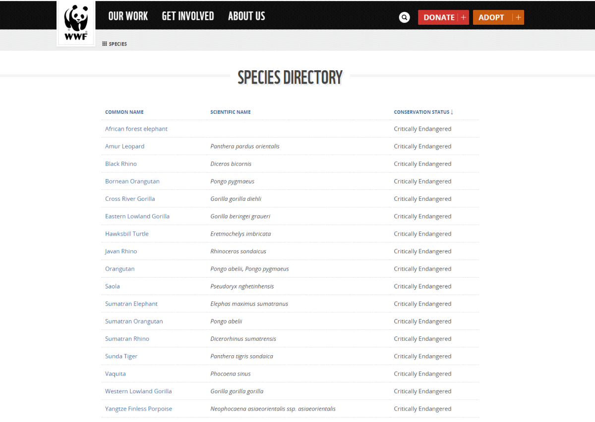
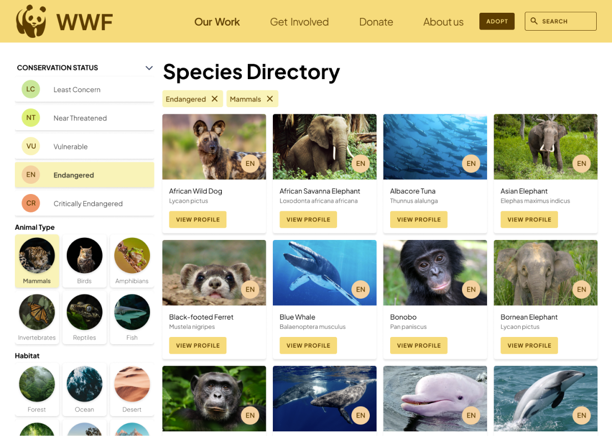
:The previous iteration of the species directory page on the WWF website presented a utilitarian approach that prioritized basic textual information. It solely allowed users to sort species by common name, scientific name, and conservation status. The lack of visual elements made the page less engaging, and the minimal sorting options provided a rigid and cumbersome user experience. This text-heavy layout without images or interactive components failed to capture the attention of visitors and did not effectively communicate the urgency of wildlife conservation. It was not conducive to learning or inspiring action, key objectives for the WWF.

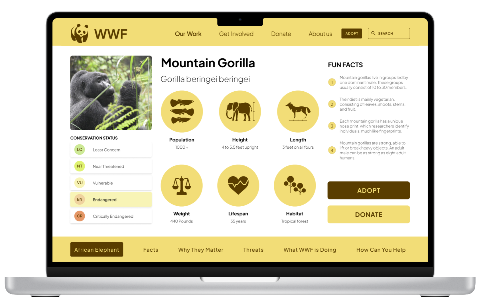
The revamped species directory page is a significant leap forward in both functionality and visual appeal. By incorporating high-quality images for each species, the directory now offers a vibrant and immersive experience that draws users in. The additional sorting filters, including habitat, geographical location, and specific threats, empower users to tailor their exploration and gain insights into the conservation landscape. This richer, image-centric design not only makes the directory more aesthetically pleasing but also transforms it into a powerful educational tool that better aligns with the WWF's mission to engage and inform the public about the plight of endangered species.
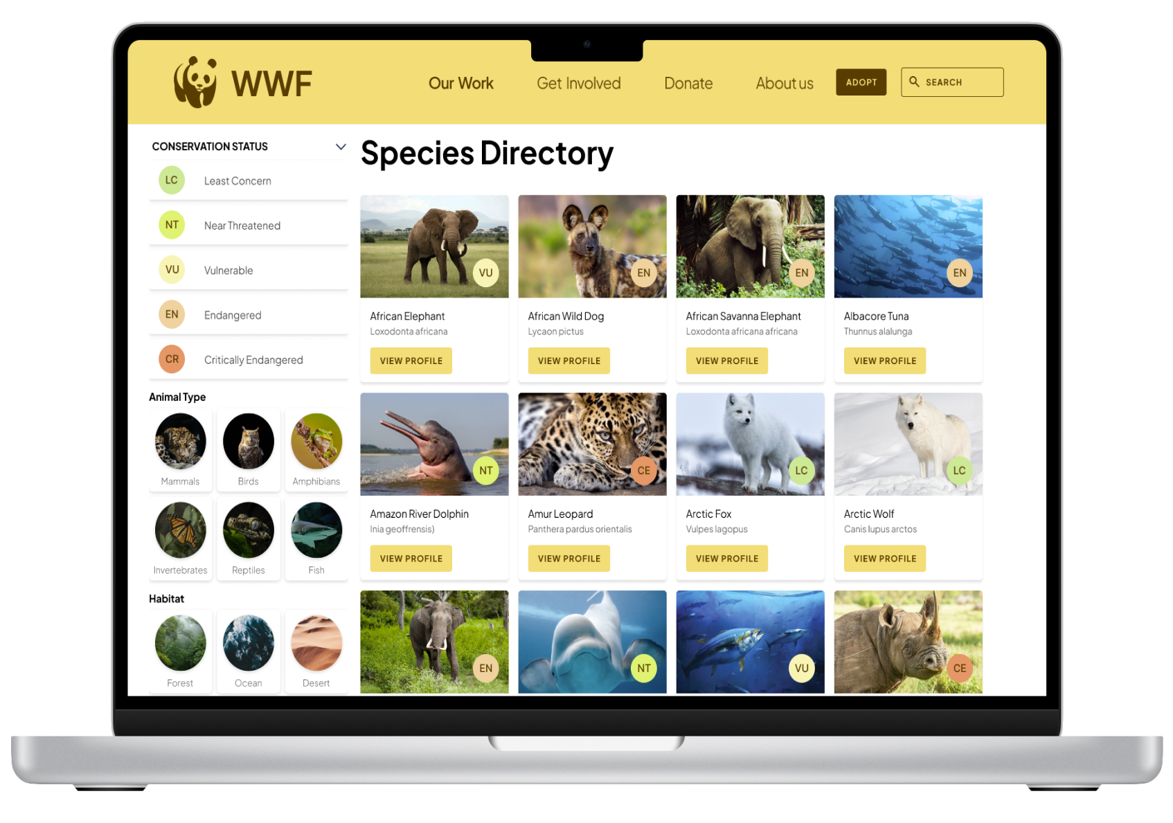

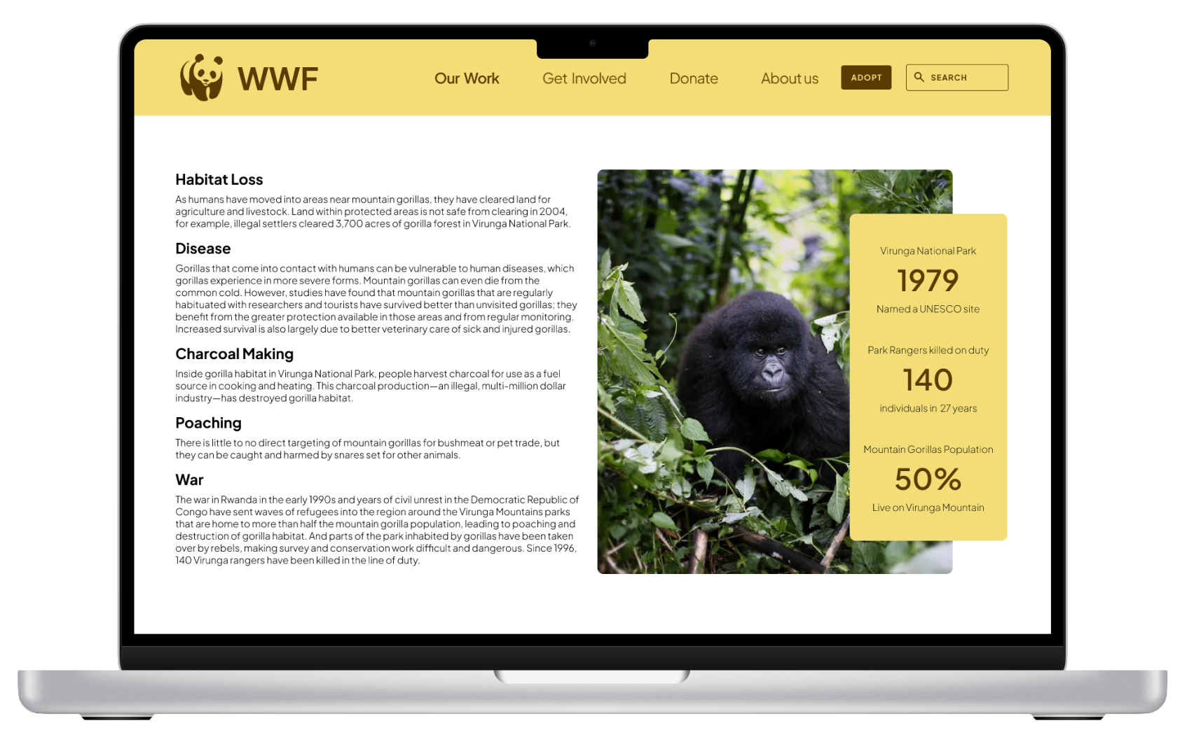

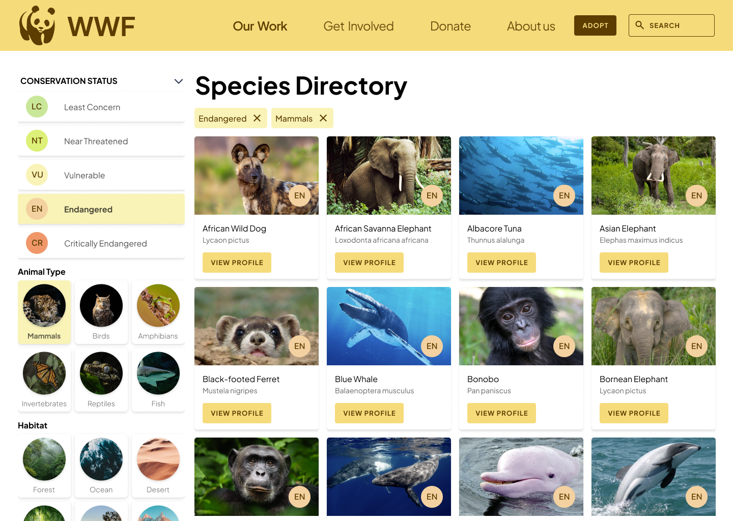

In the process of revitalizing the WWF website’s species list, I introduced a series of significant improvements, focusing on amplifying user interaction, streamlining access to detailed species information, and nurturing a more profound appreciation and understanding of wildlife. Following the deployment of these updates, I embarked on a comprehensive user feedback session. This session was crucial in evaluating the impact of the enhancements and pinpointing opportunities for further refinement. We actively engaged with our users, soliciting their insights and reactions to the redesigned interface, the new filtering options, and the overall user experience.
Improved Navigation and Accessibility Users noted that the website is now more intuitive and easier to navigate.
Users were impressed with the visuals and design,
"Finding information has become much more straightforward with the new design."
“The website is much easier to navigate now. I can find information on specific animals much faster than before."
Desire for More Detailed Conservation Information
Users were interested in more in-depth content on how they can contribute to conservation efforts."
It would be great to have more detailed information on how our actions can help these species.
Storytelling and Emotional Connection
"The use of storytelling in species profiles was well-received, with users appreciating the personal touch."
The stories about the animals make me feel more connected and concerned about their fate."
User Engagement is Crucial Interactive elements, compelling visuals, and storytelling are essential to make the species list more engaging and informative.
Ease of Navigation is Key Simplified and intuitive navigation is vital for users to find information quickly and efficiently.
Emotional Connection Drives Action Creating a personal connection through the content can significantly increase user involvement and willingness to support conservation efforts.
Transparency in Impact Users want to understand how their contributions make a difference, necessitating clear communication about the impact of donations and adoptions.
The Importance of User-Centered Design Understanding the user's perspective is critical in creating a website that is not only informative but also engaging and easy to use.
Balancing Information with Engagement Too much information can be overwhelming; it's crucial to present data in an engaging and digestible manner.
Feedback is Invaluable User feedback and testing are indispensable in the design process, providing insights that guide improvements and enhancements.
As part of the effort to improve the WWF website’s species list, I implemented several enhancements aimed at increasing user engagement, improving information accessibility, and fostering a deeper connection with wildlife. Following these updates, we conducted a user feedback session to gauge the effectiveness of these changes and identify areas for further improvement.
