SF Parks

San Francisco Parks and Recreation Picnic Planner App

The primary objective of the project is to develop a user-friendly, efficient, and comprehensive platform that assists users in effortlessly organizing picnics, thereby enhancing their outdoor experience in the city. The app aims to address the gap in existing resources for picnic planning, particularly for those without personal vehicles.

Figma Link
Product Overview
The San Francisco Picnic Planner App is a mobile web application designed to assist San Francisco residents in planning and organizing picnics within the city. It particularly caters to individuals aged 21 to 65 who do not own cars and rely on public transportation. This application focuses on providing users with information about picturesque picnic spots that offer amenities such as picnic tables, allow alcohol consumption, and have nearby bathroom facilities.
Problem Statement

Limited Access to Information: There is a noticeable lack of a centralized resource that provides comprehensive information about picnic spots in San Francisco, especially regarding specific amenities like alcohol permission, availability of picnic tables, and proximity to restrooms.

Difficulty in Spot Selection and Booking: Many residents find it challenging to identify and reserve picnic spots that are both scenic and accessible via public transportation. This problem is exacerbated by the absence of a streamlined booking system.

Goals

Simplify the Picnic Planning Process: To provide a seamless, intuitive platform that simplifies the process of finding and booking picnic spots in San Francisco, tailored to the needs of users without personal vehicles.

Improve Accessibility to Information: To offer comprehensive, up-to-date information about picnic locations, including details about amenities like alcohol policies, picnic tables, and nearby bathroom facilities.

Enhance User Experience: To ensure a user-friendly interface that enhances the overall experience of planning a picnic, especially on mobile devices, accommodating the lifestyle of the target demographic.
Design Process
Our design process was meticulously structured to ensure a user-centered approach, blending creativity with practicality. We began with an exploratory phase, where we conducted in-depth interviews to understand the diverse needs and preferences of potential users. This initial stage was critical in shaping our understanding of the storytelling landscape and identifying gaps in current digital offerings. Armed with these insights, we moved into the prototype development phase. Each team member independently crafted a unique prototype, focusing on different aspects of storytelling and memory sharing.

This approach allowed us to explore a wide range of possibilities and functionalities. Following the creation of these prototypes, we entered the crucial testing phase. Here, we employed a contextual inquiry method, observing real users interacting with our applications in their natural environment. This hands-on feedback was invaluable, highlighting areas for improvement and confirming aspects that resonated well with users.
Target Audience

The target audience for this project is adult residents of San Francisco, specifically those aged between 21 and 65 years old. This demographic primarily uses their mobile phones for daily tasks and relies on public transportation, as they do not own cars. They are looking for easily accessible, picturesque locations that offer amenities like picnic tables, the option to have alcohol, and nearby bathroom facilities. This group values convenience and ease of access, prioritizing locations that are well-connected by public transportation.

User Research
As we initiated the user research phase for the San Francisco Parks app, we engaged a diverse group of participants, spanning from young urban dwellers who rely heavily on public transportation to middle-aged and older residents who cherish the city's green spaces. Our methodology centered around semi-structured interviews, offering a balance of guided questions and open-ended conversations. This format allowed us to delve deep into users' needs, preferences, and their unique relationships with urban parks and outdoor activities.

We examined how various demographics, including tech-savvy young adults, busy professionals, and older residents seeking leisure and nature, interact with technology for recreational planning. Our approach was designed to capture a broad range of user experiences and expectations regarding park visits and facility bookings. These insights were crucial in pinpointing essential features and user interface designs for the app.
Sam
A 25-year-old IT professional enjoys playing video games with his friends.
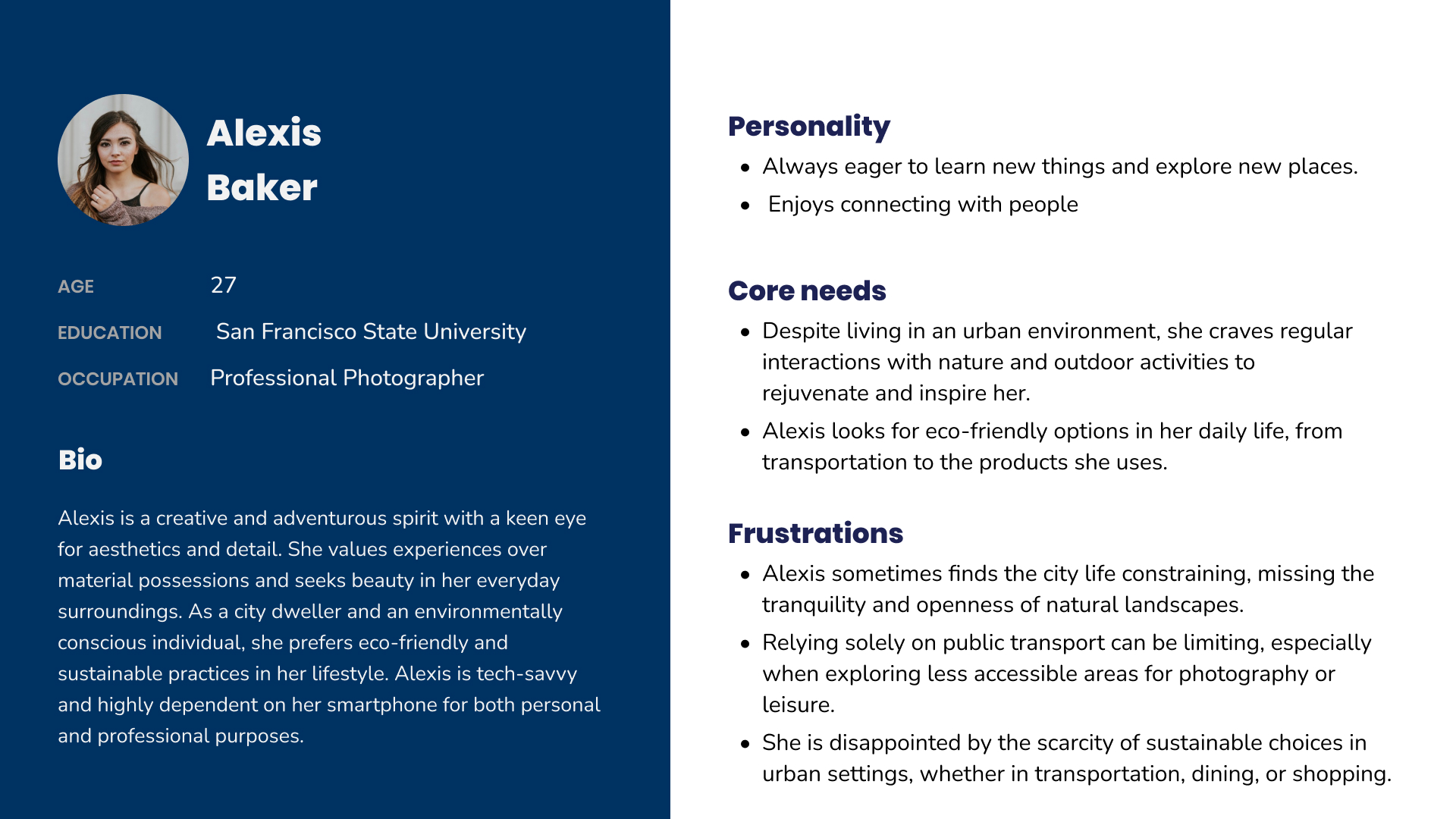
Alexis
27-year-old photographer loves design and exploring new areas in San Francisco.
Ava
32-year-old freelance graphic designer enjoys spending time going to parties and playing with her two children.
Key Insights

Demand for Simplified Navigation: Users expressed a strong preference for an intuitive and straightforward navigation system within the app. This was particularly important for those who aren't as technologically savvy, emphasizing the need for an easily navigable interface.

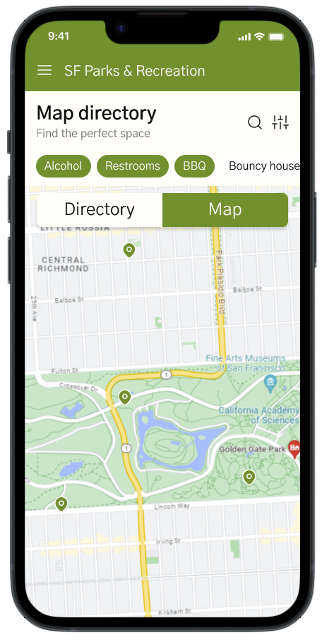
Importance of Integrated Maps and Directories: The integration of maps with park directories was highly appreciated. Users found this feature significantly helpful in locating and choosing picnic spots, highlighting the value of combining geographical information with park details in one seamless view.

Need for Clear Onboarding and Instructions: There was a clear indication that users needed more straightforward onboarding and instructional guidance when first using the app. This was crucial for ensuring that users of all backgrounds could understand and utilize the app's features effectively.

How might we

How might we design a mobile web application for San Francisco residents that simplifies finding and reserving picturesque picnic spots, equipped with essential amenities like tables, alcohol permission, and nearby bathrooms.

Pov Statement

Our users need a streamlined, mobile-friendly platform that enables them to easily discover, reserve, and access picturesque picnic spots in San Francisco with essential amenities like tables, alcohol permissions, and nearby bathrooms.
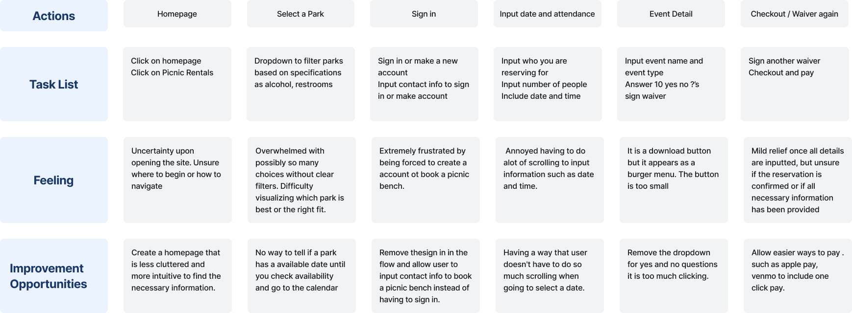
User Journey Map
User Persona
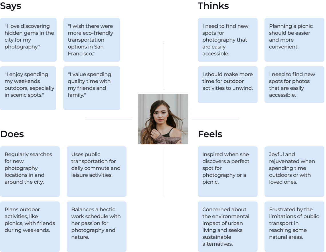
Empathy Map
Pain Points

Inadequate Details on Amenities

Users find it challenging to identify picnic spots that meet specific needs, such as the availability of picnic tables, permission for alcohol consumption, and proximity to bathrooms. The app currently lacks detailed information about these amenities, making it difficult for users to plan their outings according to their preferences.

Complex Reservation Process

The process for reserving a picnic spot is cumbersome and not user-friendly. Users experience difficulties in navigating the reservation system, leading to frustration and potential abandonment of the app.

Inconsistent Mobile Experience

he app's mobile interface is not optimized for a seamless user experience. Users encounter issues with responsiveness, layout problems on different screen sizes, and navigation difficulties.
Sketches

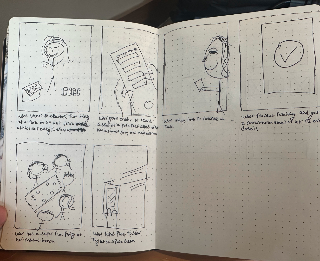
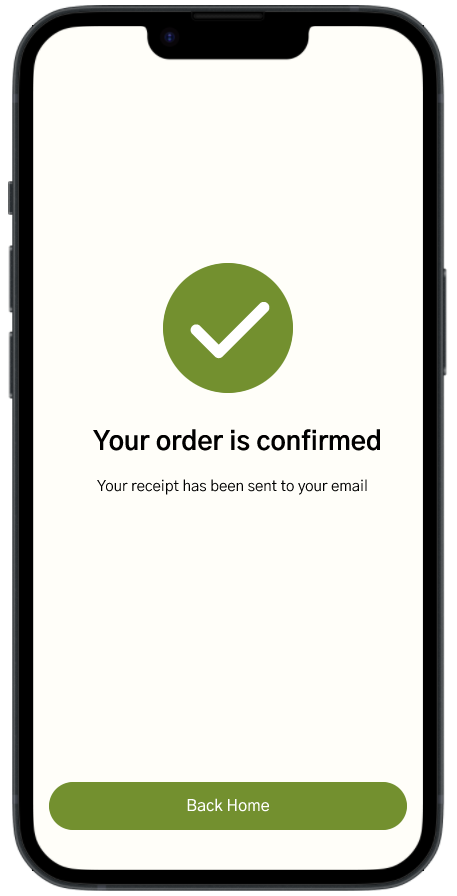
The storyboard depicts a user successfully booking a picnic bench reservation for their friends using an app. It illustrates the step-by-step process, showcasing the user's journey from selecting a picnic spot to confirming the reservation.

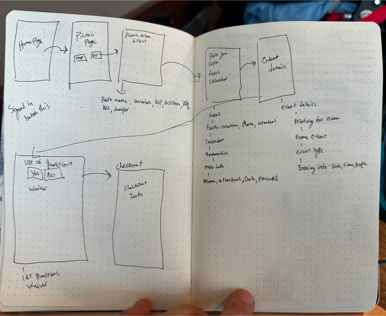
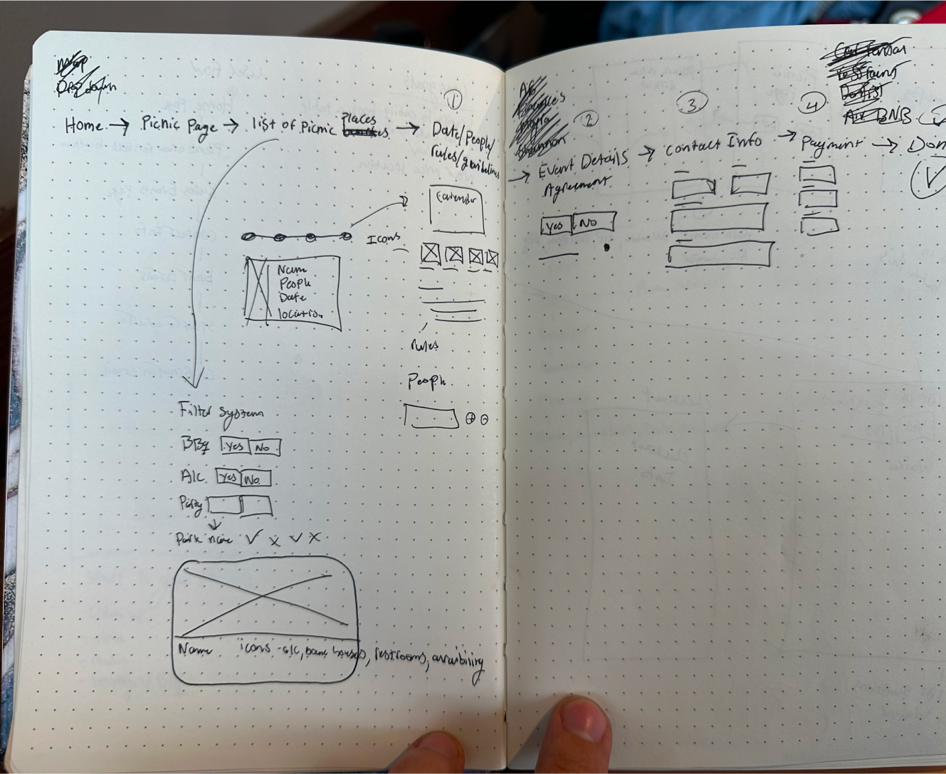
A rough visual concept outlines the current user flow of the San Francisco Reservations website, detailing the essential actions and buttons needed to complete specific tasks.

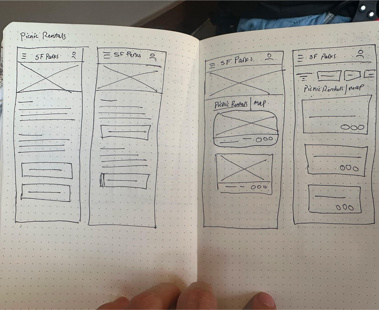
An initial design concept for the park selection page was modeled after the San Francisco Reservations website, featuring separate pages for the picnic directory and map of reservations.

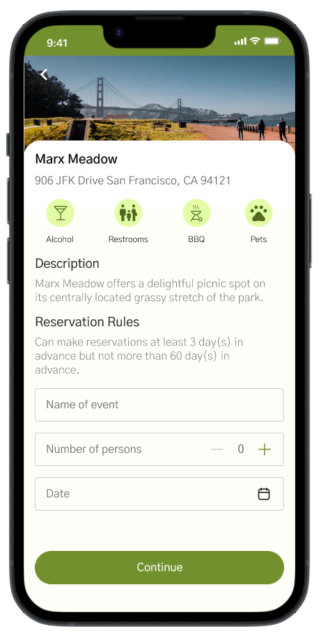
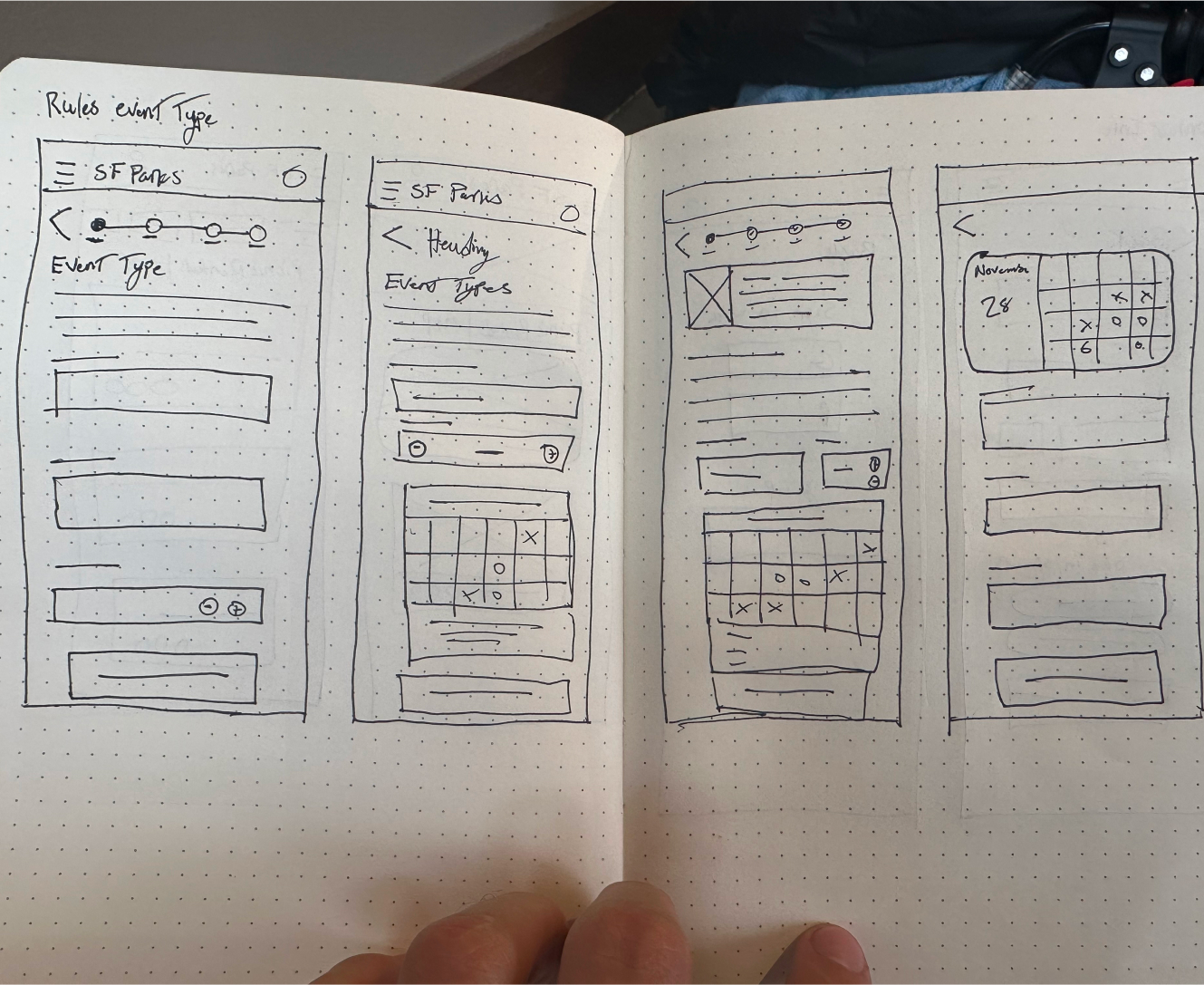
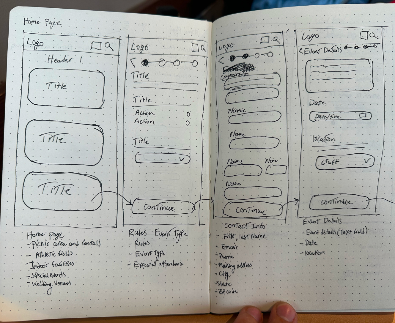
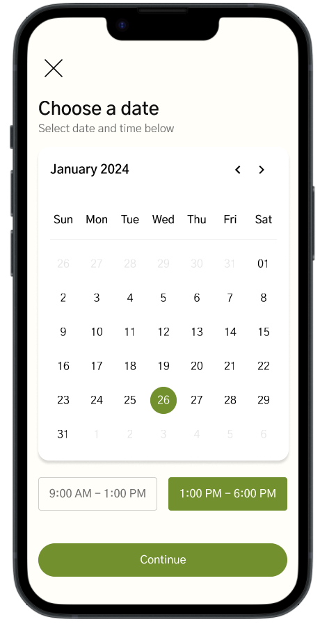
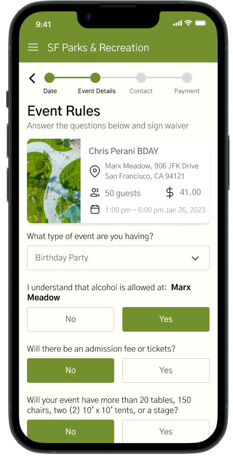
The rules and event page provide information about reservation rules and a space for users to input event details such as date, time, and name.

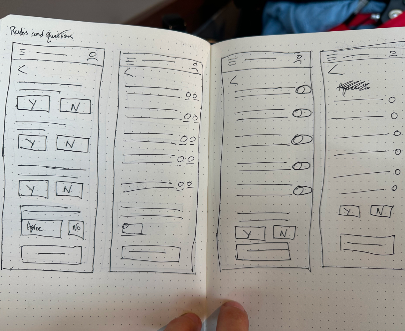
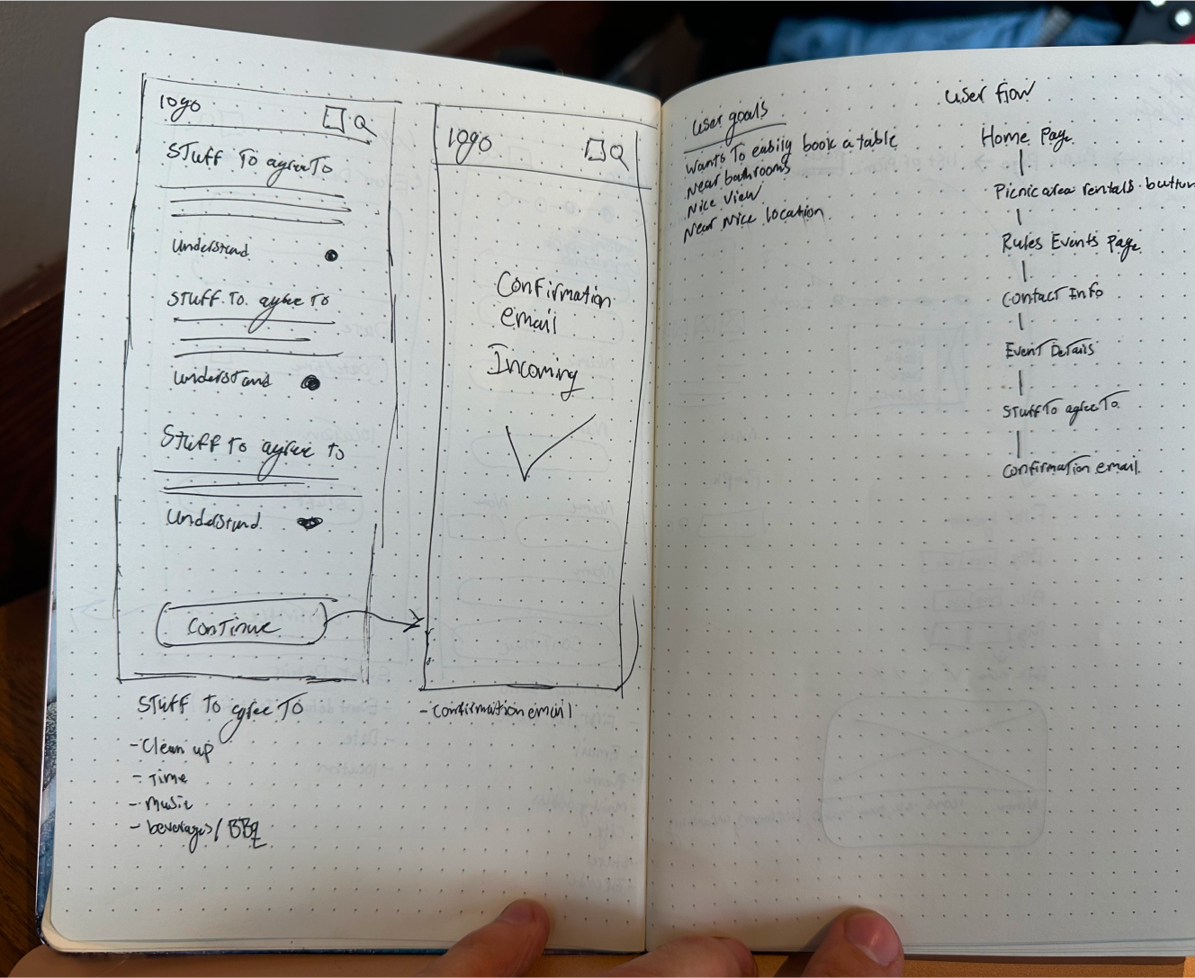
This section focuses on the rules and options for responding to questions. Different methods were explored to represent yes and no answers.

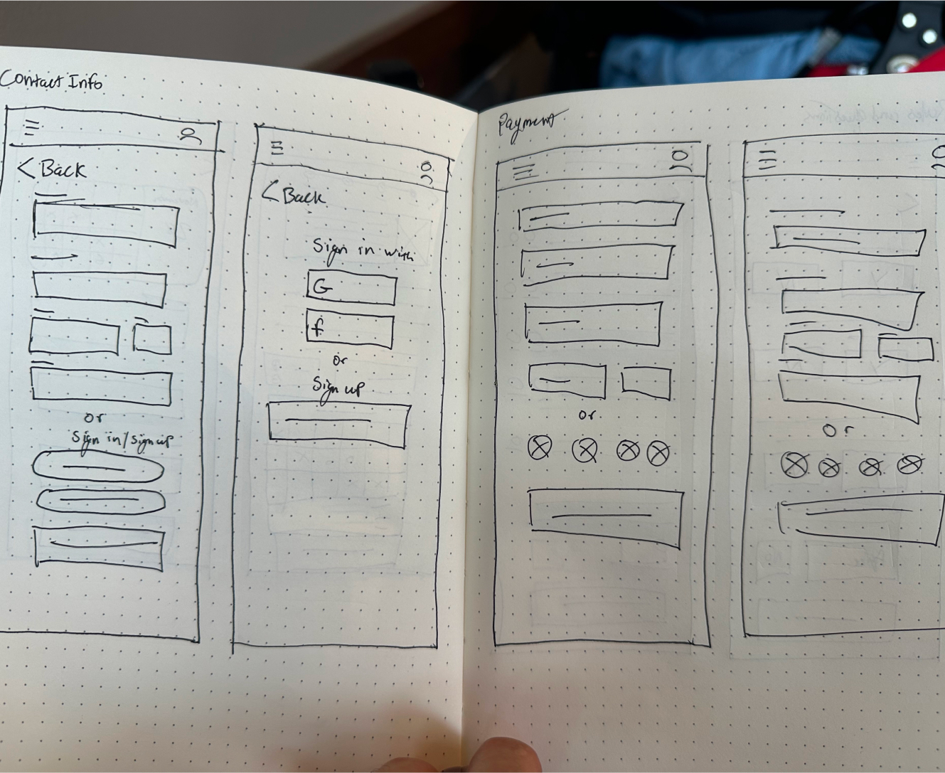
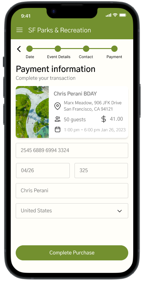
The contact and payment pages were redesigned to address frustrations with the previous requirement of signing up mid-flow on the website.

Initial sketches for the app's redesign were based on extensive drawings of all pages. These sketches were instrumental in developing the Low Fi design, with various elements from the drawings being incorporated into the final app design.

This continuation of the paper mockup includes further details of the redesign and a comprehensive user flow chart on the right, outlining the steps in the app's navigation.

Additional page showcase the visual systems intended for the final design. Many of the elements initially drawn were incorporated into the final product, reflecting the evolution of the design process from concept to completion.

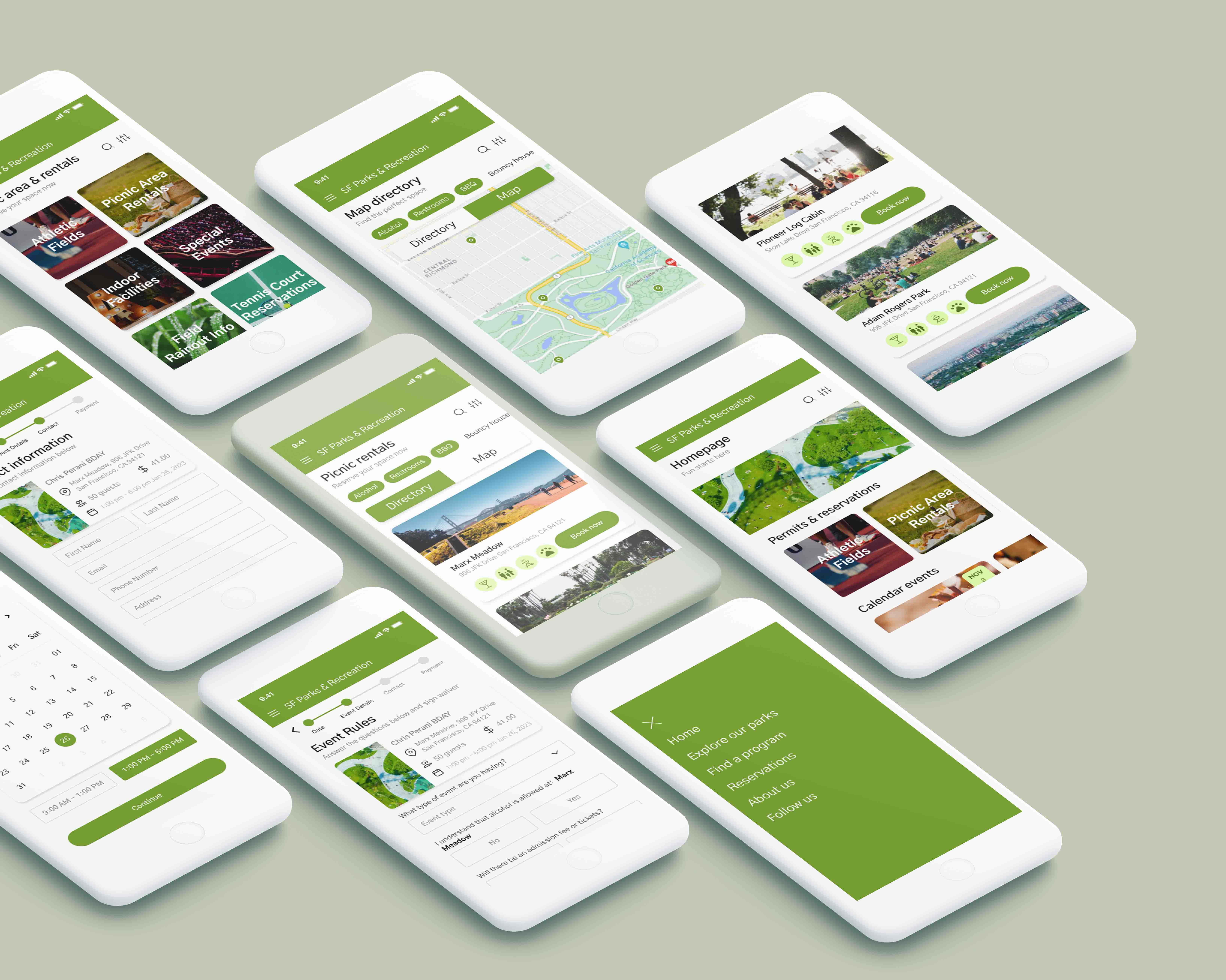
Screens

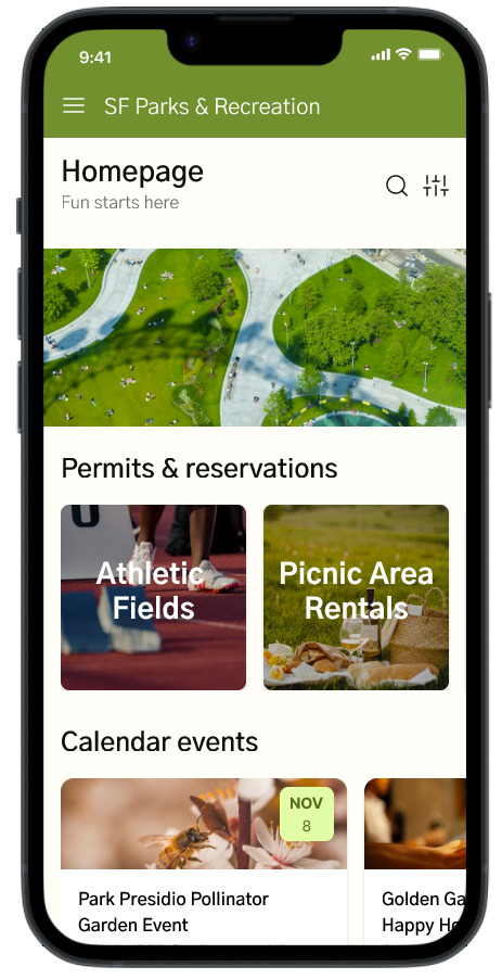
Homepage

Welcoming Interface: A user-friendly and visually appealing landing page.

Quick Access Menu: Easily accessible links to key sections like Picnic Rentals and Map Directory.

Latest Updates or News: Information on recent changes, upgrades, or events in the parks.

Picnic Rentals

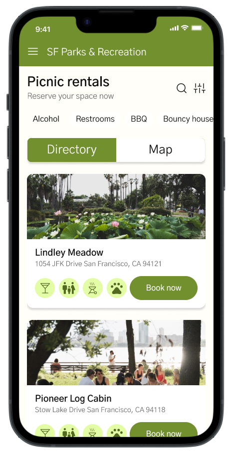
List of Available Picnic Spots: Detailed listings of picnic areas available for booking.

Filters for Preferences: Options to filter picnic spots by size, amenities, accessibility, etc.

Detailed Descriptions: Information about each picnic spot, including photos, features, and rules.

Map Directory

Interactive Map: A detailed map showing the locations of all the picnic spots.

Zoom and Navigate Feature: Users can zoom in/out and navigate to different areas of the map.

Spot Identification: Clear markers or pins on the map indicating picnic spots.

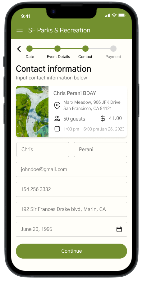
Contact Information

Personal Information Entry: Fields for users to input their name and contact details

User Flow Tracker: A visual indicator or progress bar showing the user's current step in the overall booking process.

Summary of Selections: A display block resembling a receipt, showing previously selected details such as date, estimated cost, and the number of people.
Screens

Video

User Feedback

This diverse group of users, spanning various ages and lifestyles, provided a wealth of feedback that shed light on both the strengths and areas needing refinement in our app. They expressed high praise for the app's functionality in simplifying the process of locating and booking picnic spots in the city, particularly valuing the integrated map and directory feature. This aspect was seen as a game-changer in enhancing the user experience.

However, they also highlighted some challenges. Notably, users with less digital literacy struggled with certain aspects of the app's interface. This feedback emphasized the necessity for more intuitive navigation and a more streamlined onboarding experience, signaling that while our app effectively addresses the primary need, it requires further simplification and clearer guidance for all users.

Integration of Map and Directory
: Users overwhelmingly appreciated the seamless integration of the map with the directory of parks, making it easier to find and select picnic spots.

Usability Challenges for Less Tech-Savvy Users: Some participants found the navigation and interface less intuitive, suggesting a need for a more straightforward design, especially for those who are not as technologically proficient.

Importance of a Clear Onboarding Process: The initial engagement with the app was confusing for some users, indicating the need for a more simplified and informative introduction to the app's features and functionalities.

Positive Reception to Aesthetic Design: The app's visual design received praise for its appeal and user-friendly layout, contributing positively to the overall experience.

Key Takeaways

Integration of Maps and Directory: Users appreciated the merging of the directory and map of picnic areas into a single, easily navigable page. This integration streamlined the browsing experience and reduced navigation complexity.

Visibility of Selections: Including a snapshot of the user's selections (such as event name, location, time, date, and price) throughout the design process was crucial. It helped users keep track of their choices and made the process more transparent and user-friendly.

Map Directory Page Addition: Adding a map directory page responded to a user need for geographical orientation. It addressed the difficulty in selecting picnic areas based only on addresses.

Progress Indicators: Implementing a progress bar and distinct headers helped users understand their position in the booking process. This visual guide reduced confusion and increased user confidence in completing the task.

What I learned

User-Centered Design is Crucial: This project reinforced the importance of focusing on the user's needs and preferences throughout the design process. By considering the lifestyle, habits, and preferences of the target user the design became more relevant and user-friendly.

Simplification Enhances User Experience: The integration of maps and directories, and the streamlining of the user flow, demonstrated that simplifying the navigation and selection process significantly improves user satisfaction. It reduces cognitive load and makes the app more intuitive, which is essential for a diverse user base.

Feedback is Invaluable: User testing and feedback were instrumental in identifying areas for improvement. Changes like the visibility of selections and the addition of a map directory page were directly influenced by user input. This highlighted the importance of iterative design and the need for continuous user engagement.

Error Handling is a Key Component of Design: Learning to anticipate and effectively manage error states is vital in maintaining user engagement and preventing frustration. Clear and helpful error messages guide users towards resolving issues, enhancing their overall experience with the app.

If I had more time

Map Locator Integration: Adding a map locator to each park card would allow users to see the park's location without leaving the app.

Collapsible Event Detail Card: Implementing a dropdown feature for the event detail card would conserve screen space, making the app more visually appealing and easier to navigate.

Search Functionality: Introducing a search function for specific parks would further streamline the user experience.

Conclusion

The redesign of the San Francisco Parks and Recreation mobile app was an enlightening journey into the heart of user-centered design. This project underscored the critical importance of understanding and catering to the specific needs of the target audience – in this case, San Francisco residents reliant on public transportation and heavily engaged with their mobile devices.

Throughout the design process, key learnings emerged that shaped the final outcome. The integration of maps with a directory, the inclusion of a clear and concise progress bar, and the implementation of intuitive error messages significantly enhanced the user experience. These features not only streamlined the navigation process but also provided users with a sense of control and transparency.

Projects

COS X Chris Perani
UX Design
A 24-piece collaboration with COS, bringing macro photography to fashion in over 150 stores worldwide, transforming the hidden details of nature into wearable art.
LEARN MORE
Photography
Photography
A photography portfolio showcasing a collection of technically sophisticated images, each meticulously composed with a focus on precision and detail, highlighting the artistry in technical photography.
LEARN MORE
CCWIP
UX Design
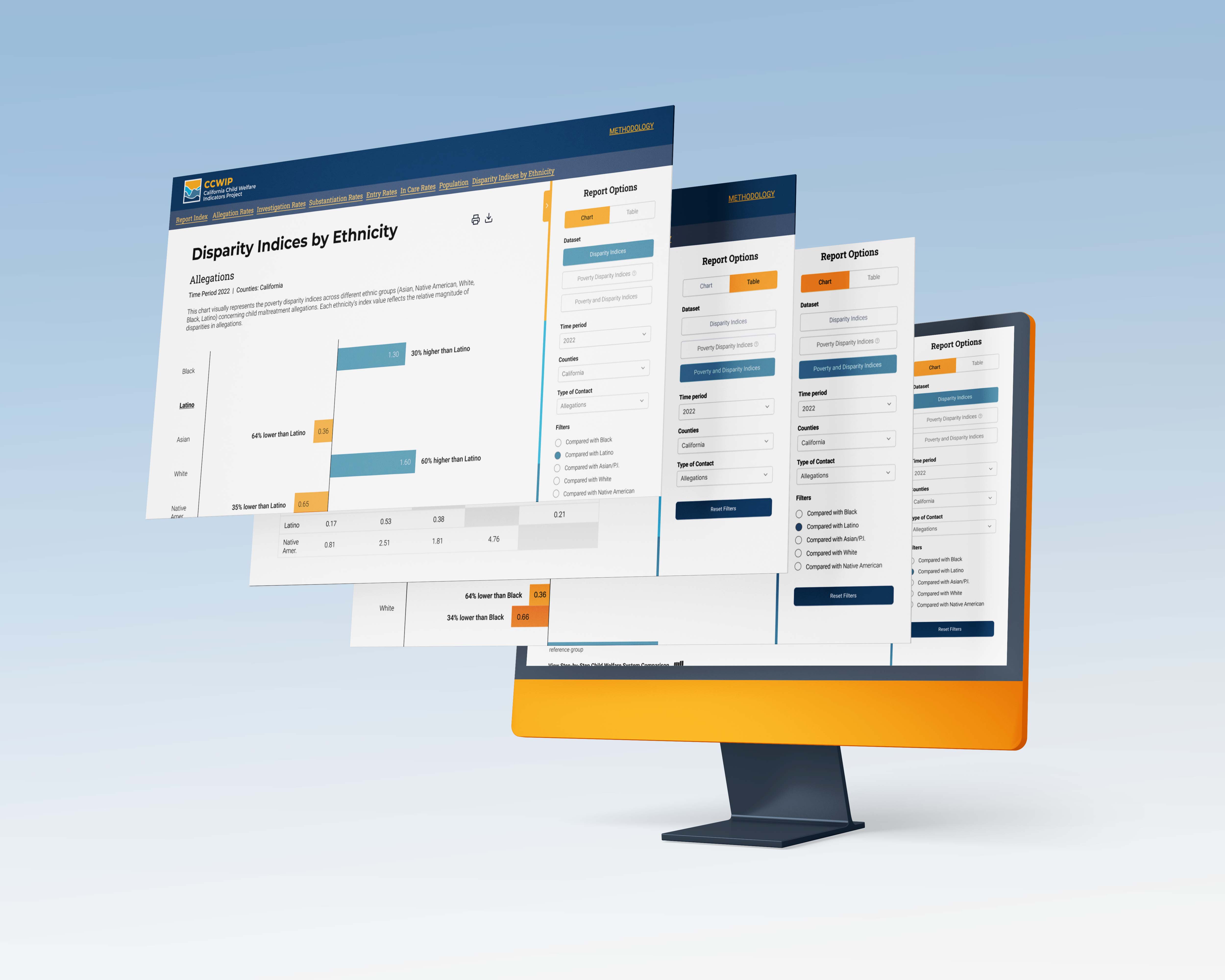
A project focused on redesigning CCWIP's data visualizations, enhancing the representation and accessibility of critical child welfare indicators for clearer, more impactful insights.
LEARN MORE
Geospatial
UX Design
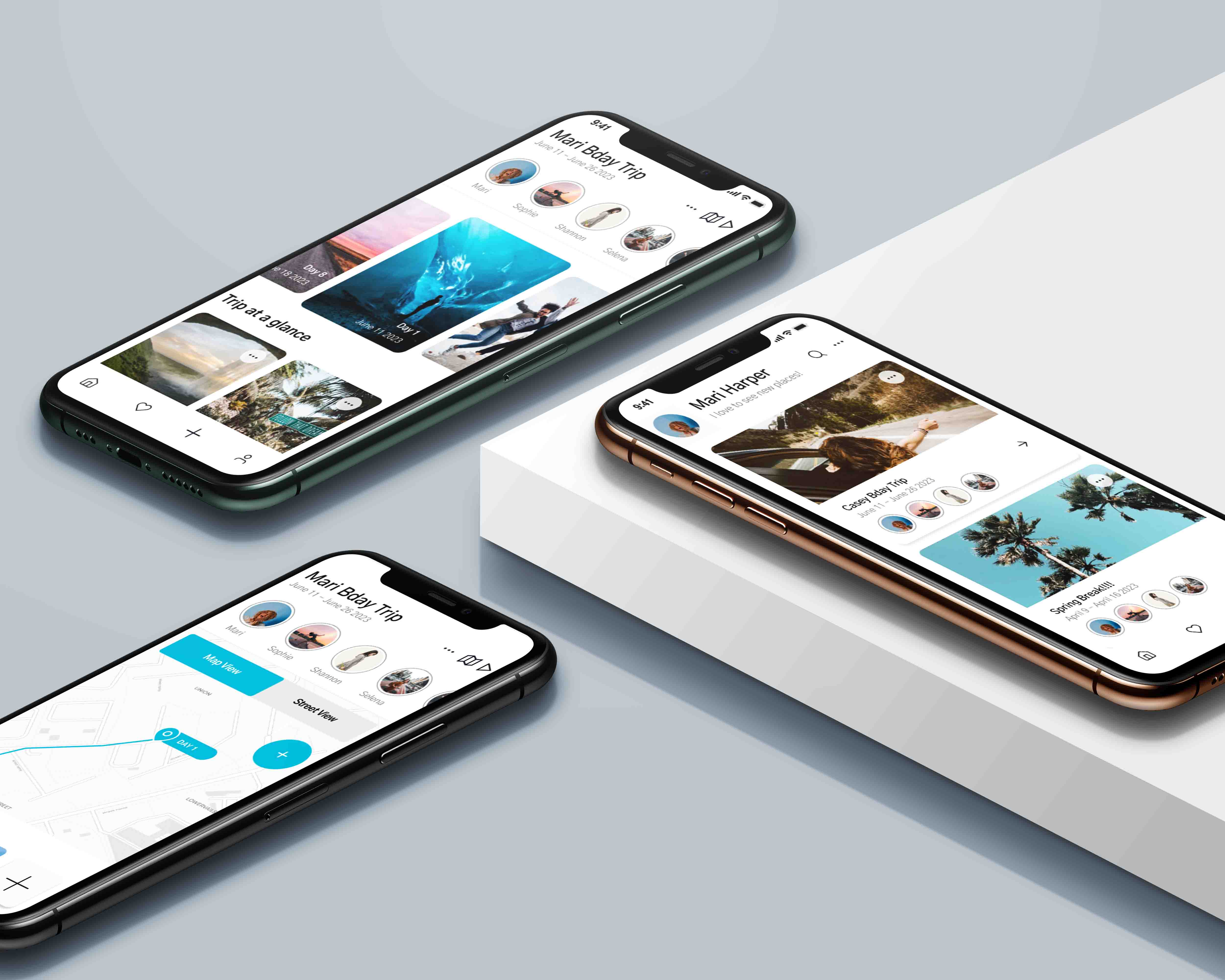
A collaborative storytelling app project, where each group member uniquely crafted their own storytelling experience, exploring diverse and innovative ways to weave narratives through app technology.
LEARN MORE
SF Parks
UX Design
A mobile application designed for San Francisco's parks and recreation, offering users the convenience of reserving their ideal picnic spot across the city's picturesque parks.
LEARN MORE
WWF
UX Design
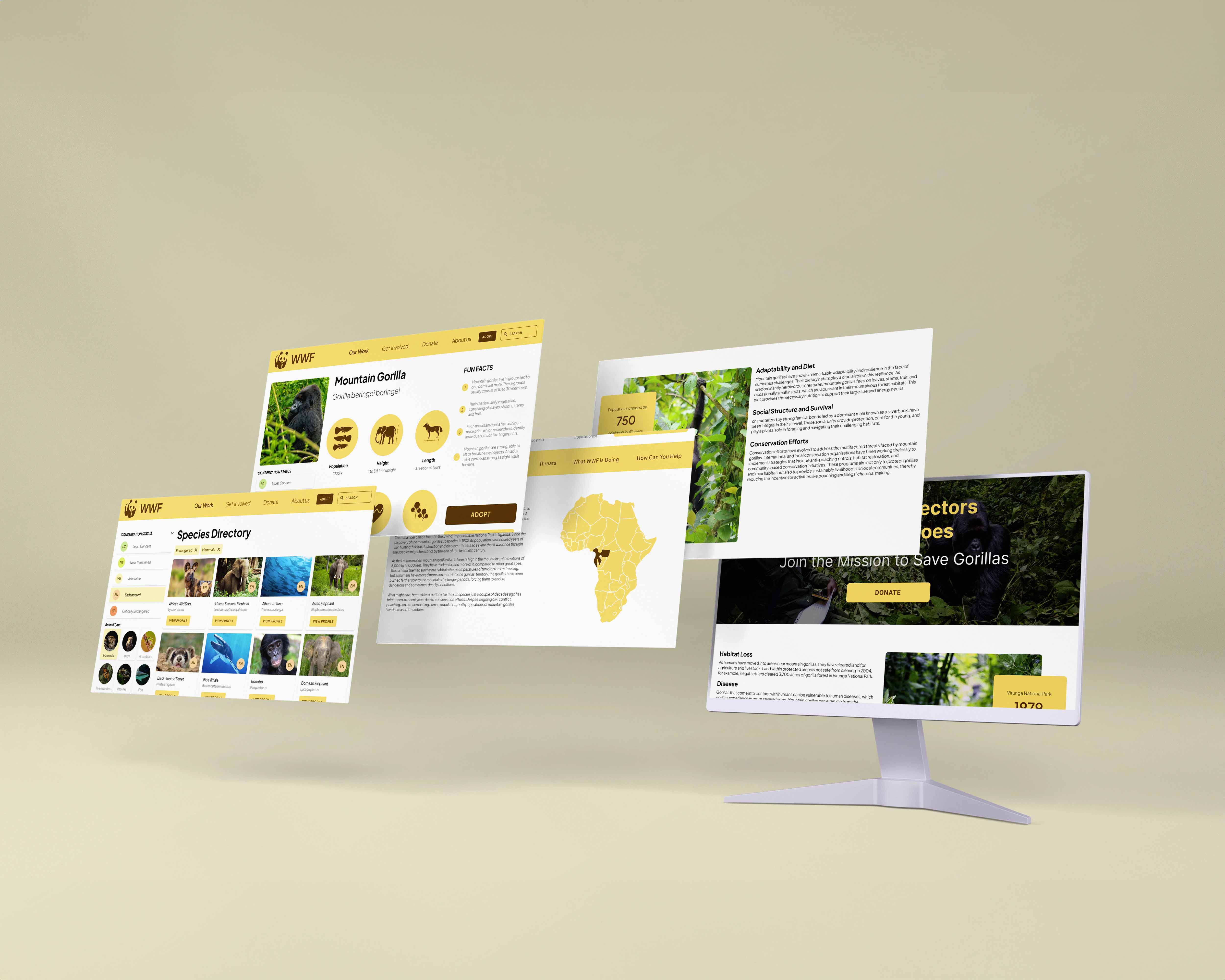
The redesign of the WWF species page transforms user engagement and conservation education through an intuitive interface with advanced sorting features and detailed species information.
LEARN MORE
Graphic Design
Graphic Design
A visual journey showcasing my creativity, skill, and passion for transforming ideas into engaging, impactful designs.
LEARN MORE
Photogrammetry
Photogrammetry
This collection features experiments with 3D scanning techniques, resulting in the creation of unique and dynamic models, each specifically tailored for augmented reality applications.
LEARN MORE